Zeta
Overview
We helped Zeta increase awareness, sales and the bond between Sweden and Italy. By telling their story, Zeta went from being 400 products to one unified brand with heart.
CHALLENGE – GROWING COMPETITION After over 40 years in the business, Zeta was best known for their olive oil and needed to defend their space in the supermarket – by becoming a brand known for their story. We began working with Zeta in 2014, just as private label groceries were starting to explode. To fortify their position in the supermarkets, Zeta’s identity needed to be defined and declared. While Zeta offered tasty, high-quality food products, the brand itself didn’t carry meaning to the consumers, lacking a strong emotional bond. Therefore, it was easy to replace.
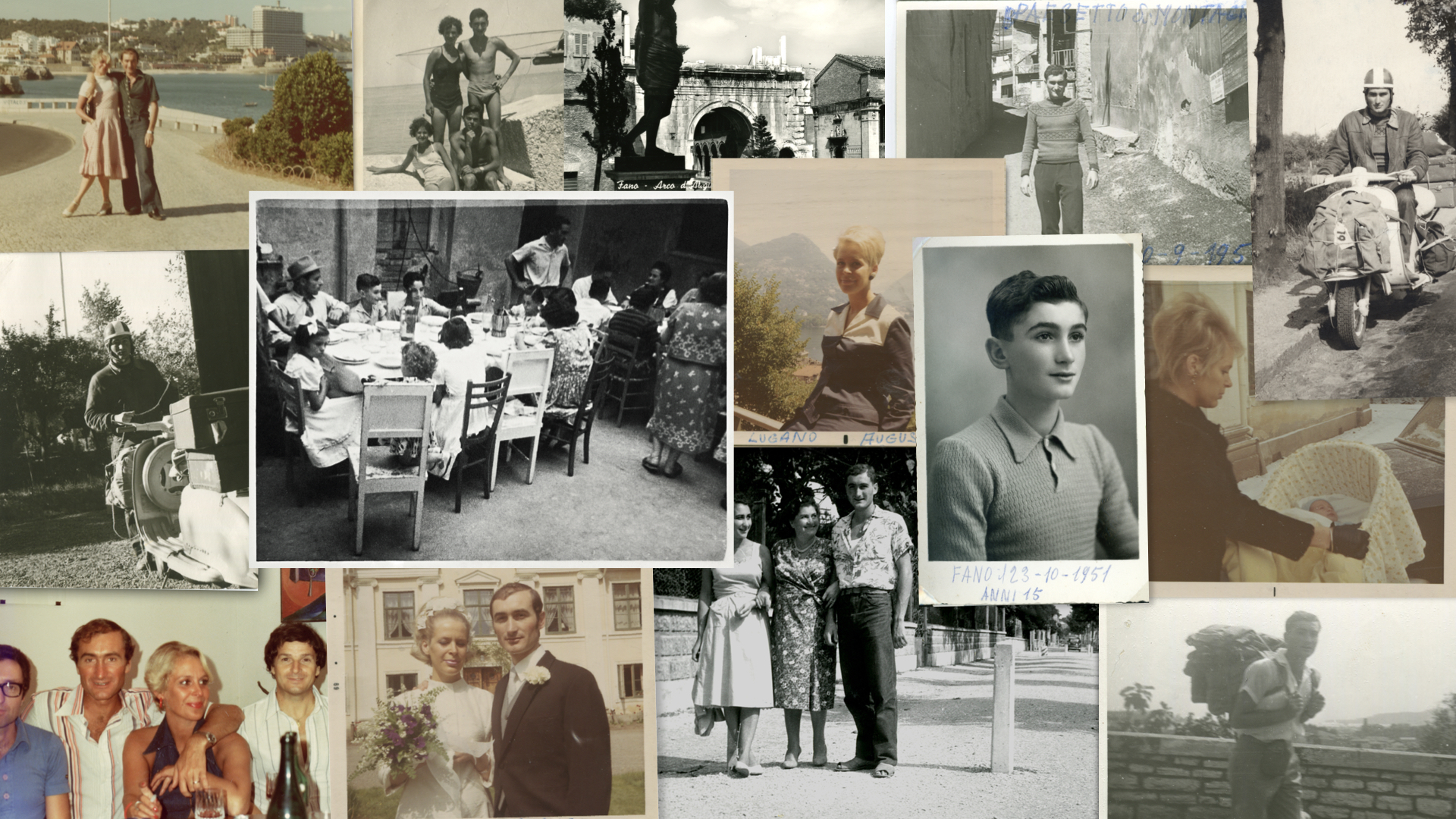
Approach – a family business We began our work with a deep analysis of the brand, including the market, customers, and the competition. We also had several workshops with the core team to get the insights we needed to continue our work. With founder Fernando and his children as a central part of management, we had unique access to the brand’s actual core – while learning invaluable lessons on the virtues of carefully selected ingredients of the highest quality. With the family being an integral part of the discussions, we were able to learn the history of the brand, straight from the horse’s mouth.
Concept
From a family where food is love
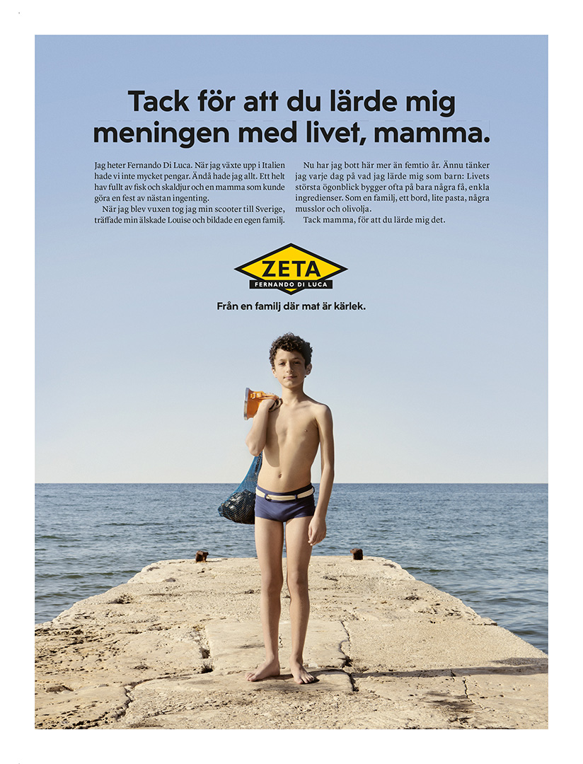
A real family business with an emotional story to tell The story of Zeta begins back in 1961, in Italy and the small coastal town of Fano, just south of Rimini. A young and adventorus Fernando Di Luca had just graduated school when he hopped on his Lambretta and left Fano for Stockholm. The lack of luggage space didn’t affect him – the material things he left behind were no longer important to him. His soul was filled with Italian flavors, family recipes, and dining culture. That’s why the concept focuses on the Italian origin of the family business.
Brand identity
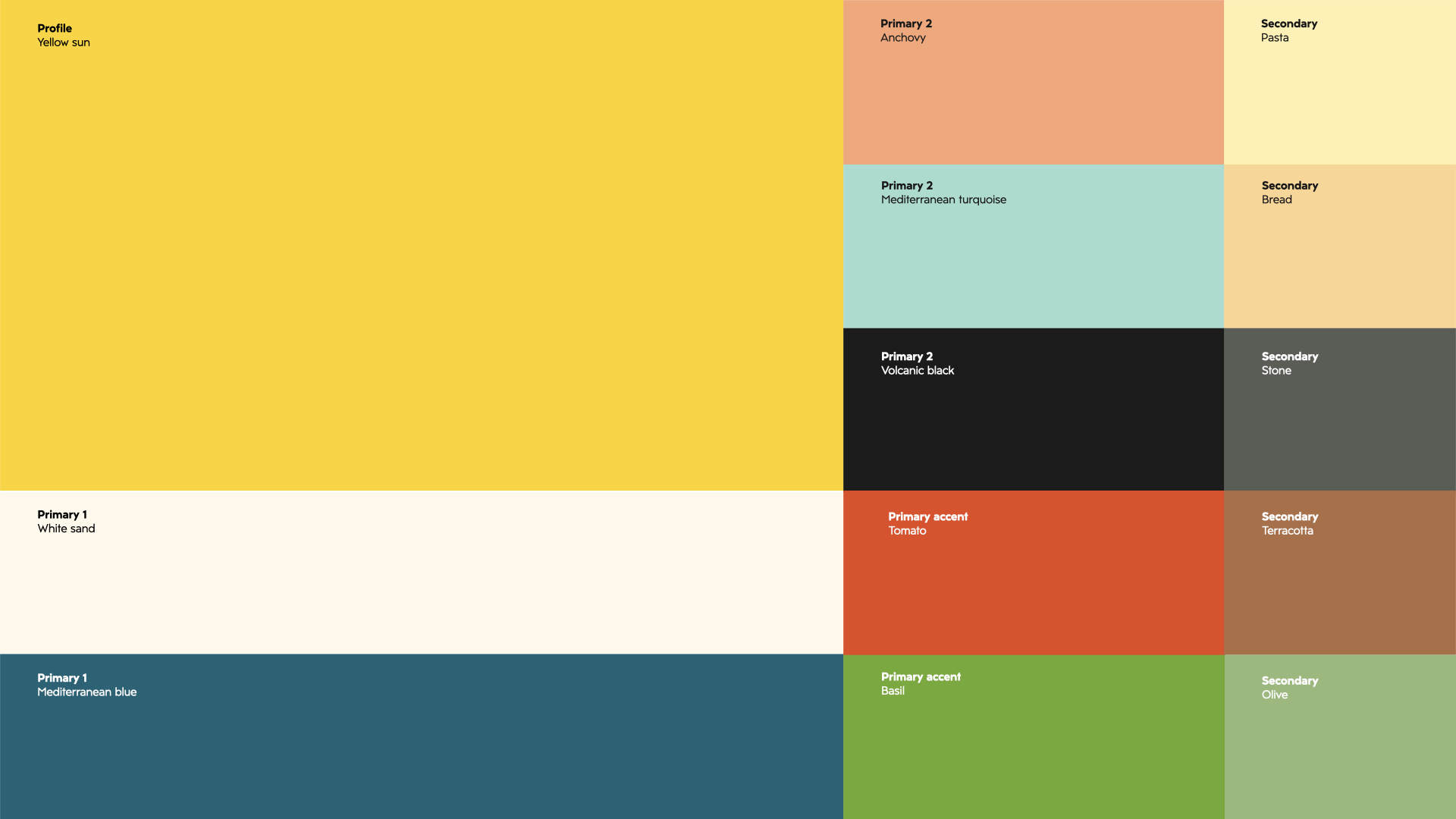
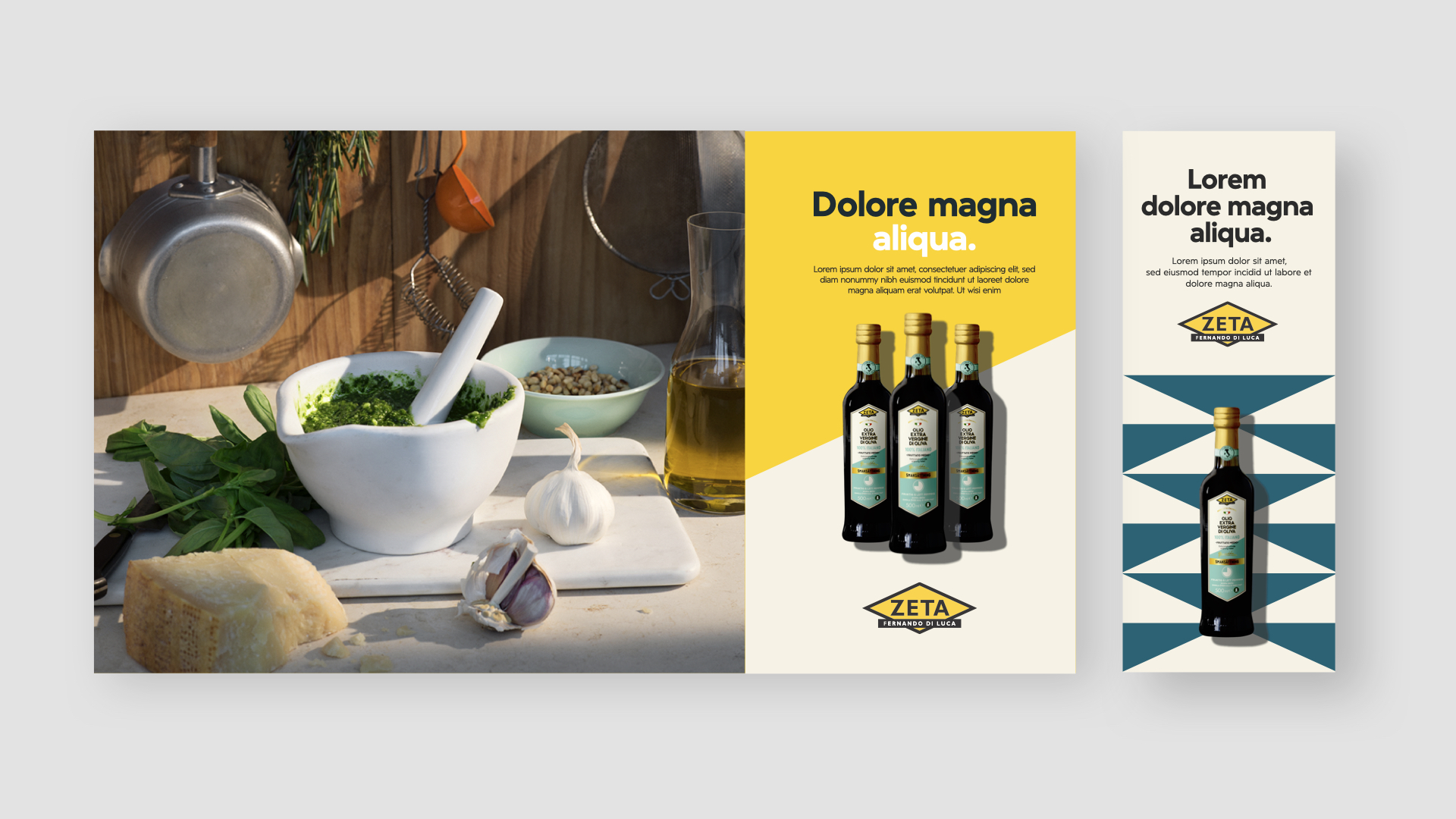
Bringing the story of passion for food into the design In addition to the brand story we needed strong and cohesive visibility throughout the grocery stores. Fernando di Luca and his stories are our inspiration behind the concept, and as we developed the brand assets, we always tried to find the perfect balance between Italy and Sweden – in everything from colors, typography, imagery, and tonality.
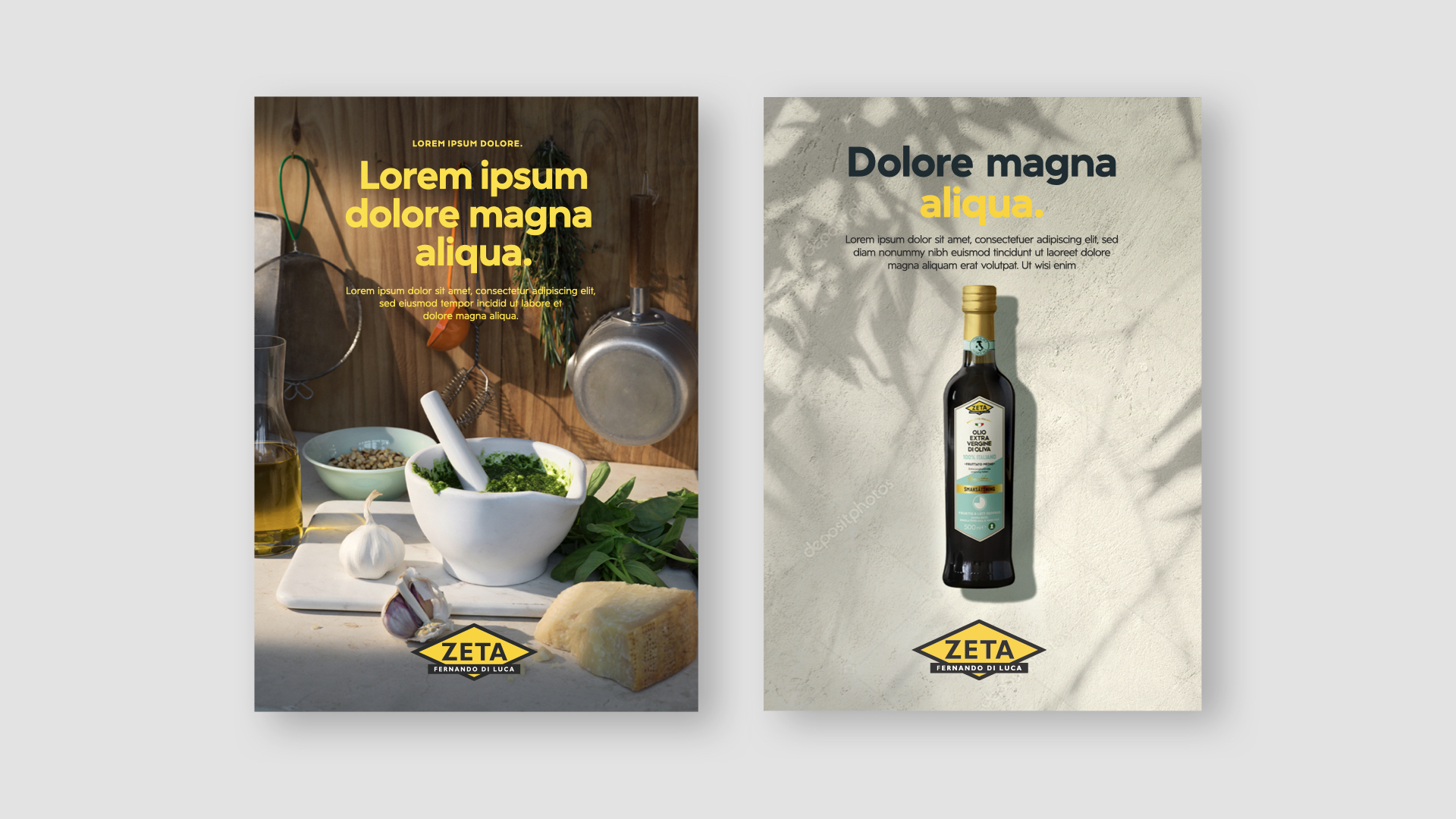

Custom typeface We wanted to create a typeface suitable for a wide range of communication areas, regardless of medium. It was important that it felt modern, but we didn’t want to lose its old Italian origin. Therefore, we took inspiration from Italian Art Deco, resulting in an original typeface that has Zeta’s history written all over it. Furthermore, we developed several different weights and styles that are easy to adapt to every conceivable area of use.

Reinventing Fernandos handwriting As a homage to the Zeta typeface, we wanted to create an even more distinctive typeface. A typeface that would both draw from Zeta’s history and further harmonize with the new illustration style. This resulted in the personal Fernando Di Luca Script, a typeface completely based on Fernando’s handwriting.
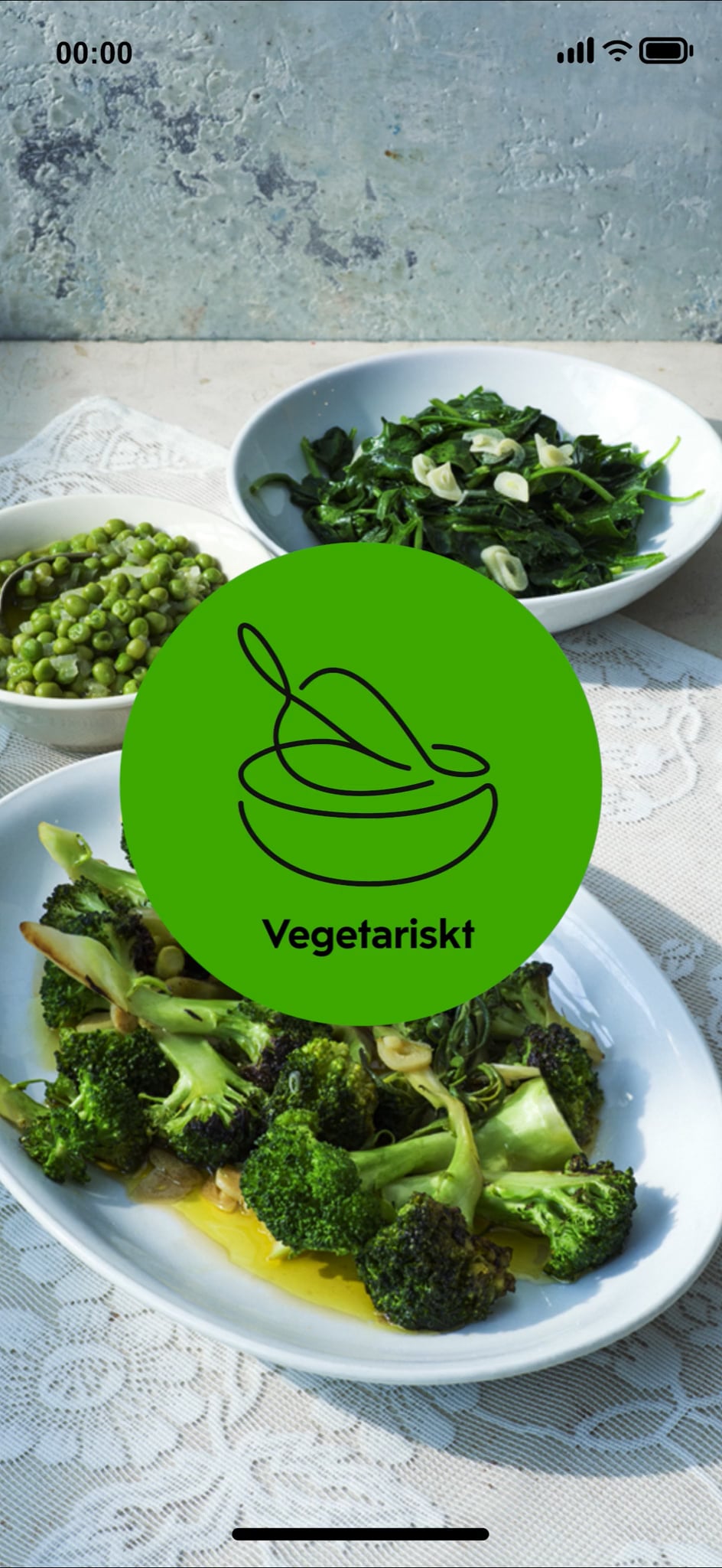
Illustrations We worked with a lot of illustrations to strengthen Zeta’s brand even further. The illustrations were hand drawn and covered a wide range of motives, stretching from more decorative ones to pure iconography. Regardless of motive, they were all one-line drawings that connected well with Fernando’s handwriting. Furthermore, they were easy to work with and experiment with, and pleasant to transform into motion.

Categories We created several motives to give the consumer a quick understanding of what kind of content they were looking at, whether it was a newsletter or a social media post with, for instance, delightful travel tips.
Packaging design
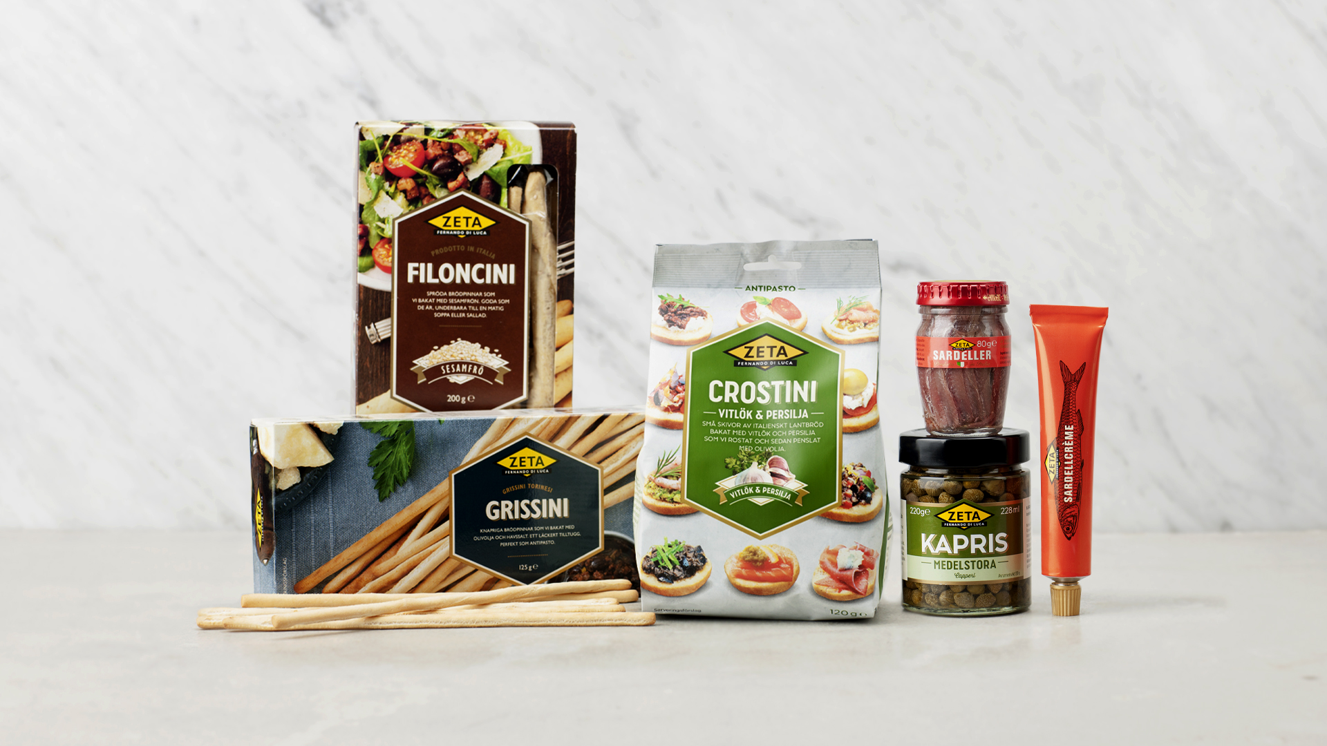
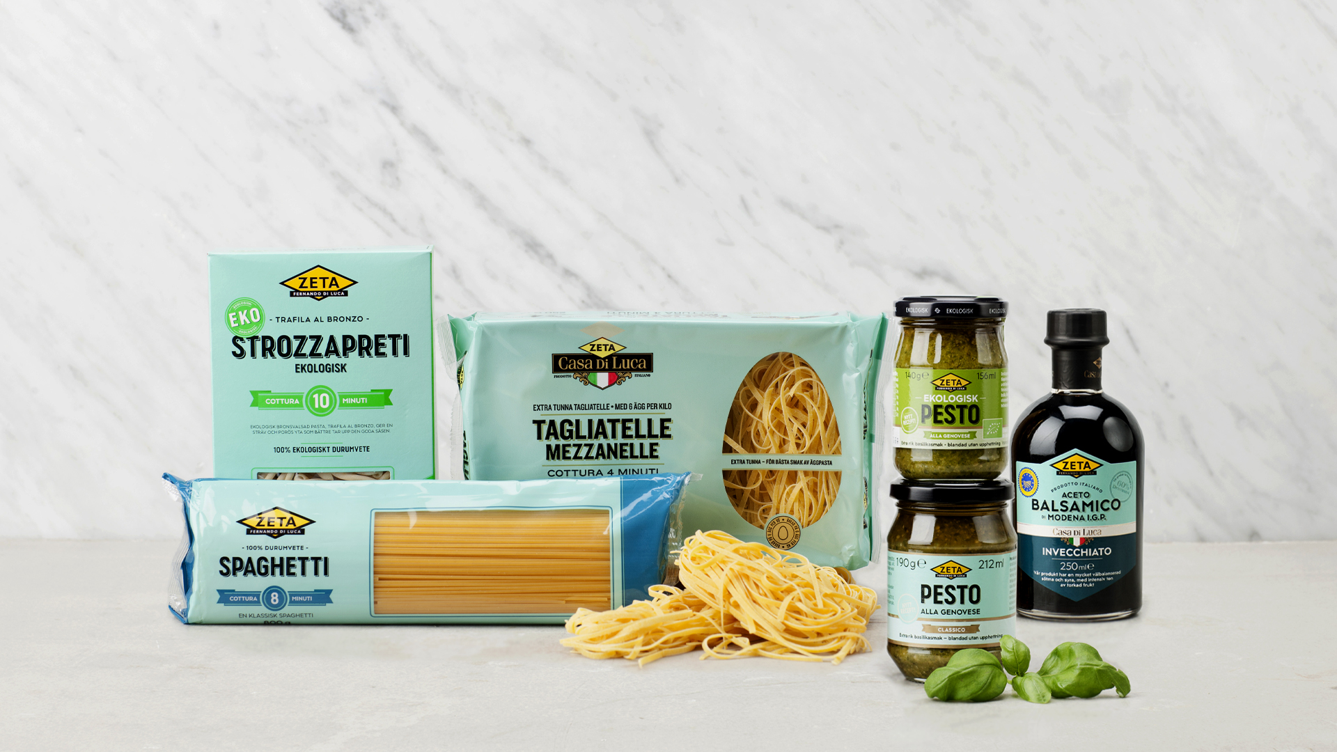
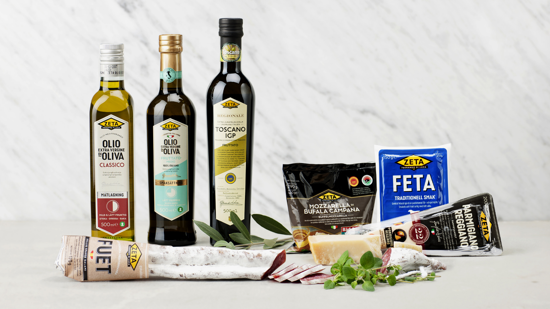
Over 500 products Since Zeta has a wide product range, we have created a toolbox to easily categorize the products, and at the same time maintain a cohesive expression.

Communication
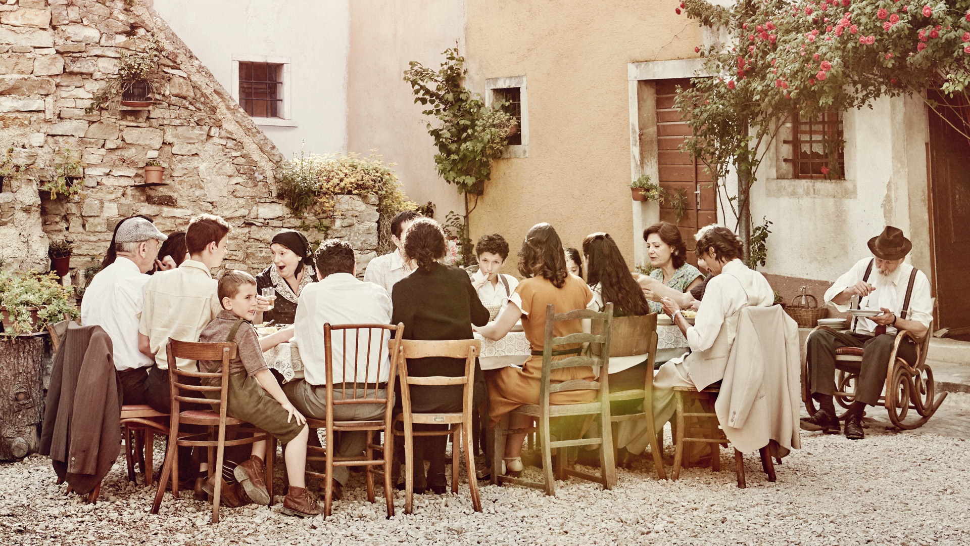
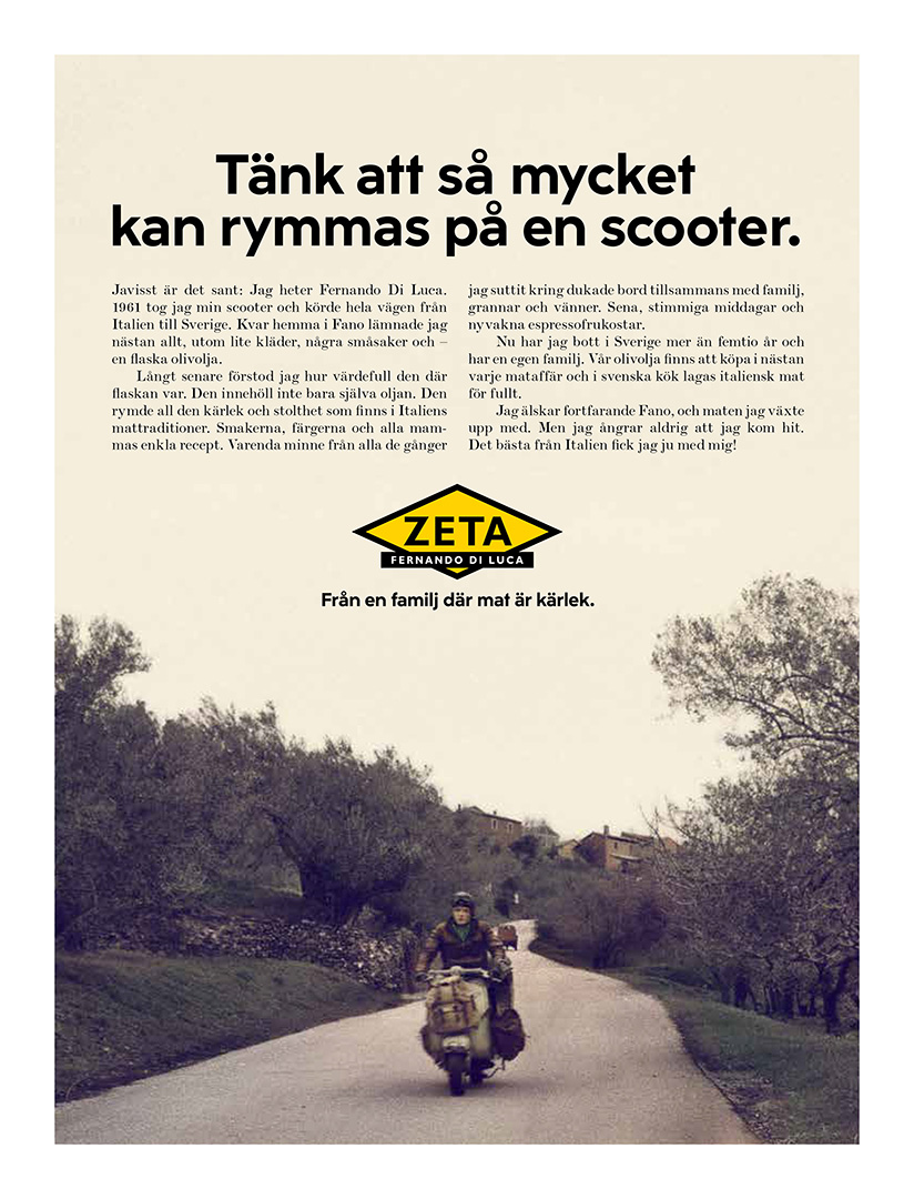
A life story Fernando di Luca has lived a long and eventful life, to say the least. It’s all of his amazing stories we build our communication upon, and that’s truly what makes this brand so unique. Through these stories, we have created everything from commercials and print ads to books and events – strengthening the concept of “From a family where food is love” even further.
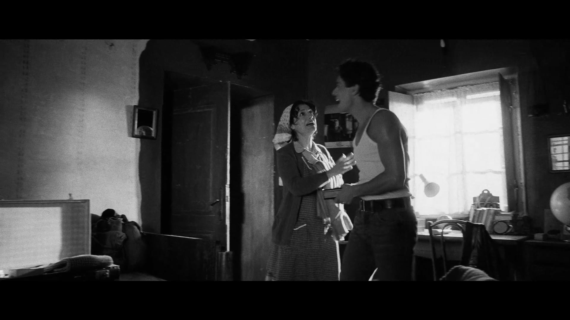
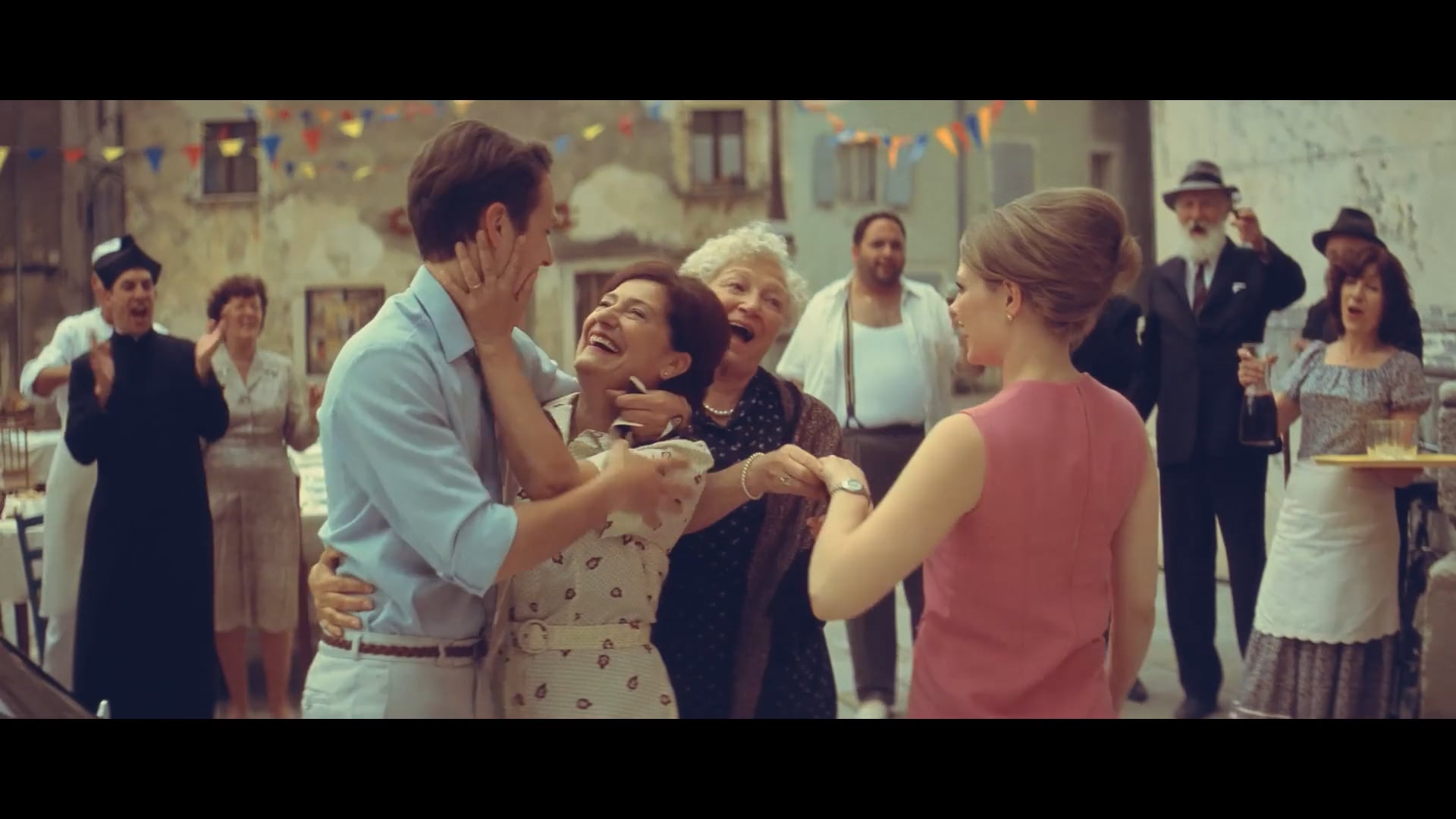
This story began back in 1961 when Fernando di Luca decided to hop on his scooter and leave Italy behind. Seeking new adventures, he traveled through Europe, and eventually, he ended up in Sweden. We say Ciao! to his Italian family left in Fano, but Fernando doesn’t leave his childhood home empty-handed: he brings the Italian food culture with him.
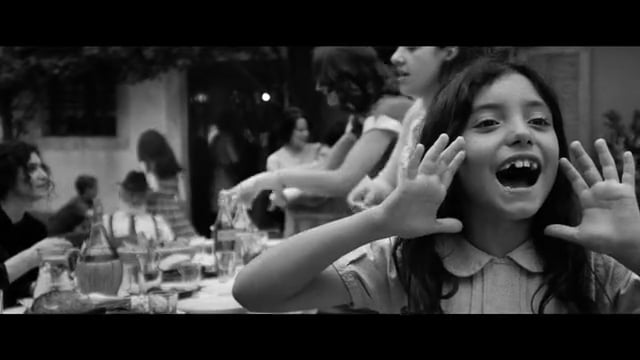
Childhood in Fano This time, we get to meet the young Fernando. This is the story of a young boy and how his passion for Italian cuisine began with his mother’s cooking, in the kitchen at Via Martino 6.
Results
”For those who have seen the campaign, the purchase intention is between 71 and 77 percent – the highest we have ever seen!”
– Tre Kronor Media – 2021.11.15
We established a strong brand – honest, genuine and with strong family values. 7 out of 10 people claim they remember the core marketing message of the campaign. Our work continues with integrated communication and PR.
BRAND AWARENESS
SALES INCREASE
Silver 100 Wattaren
Grand prix Publishing Priset
Gold Publishing Priset
Diploma Publishing Priset
Diploma Strategy Awards
Gold Svenska Designpriset
Silver Svenska Designpriset
Diploma Svenska Designpriset
Campaign of the year Dagligvarugalan
Cases
Musti Group
We future-proofed and accelerated Musti’s Nordic market leadership by uniting multiple brands under one promise: Pets’ Best Friend.

Wise
We helped Wise transform from a house of brands into one unified brand – building clarity, coherence, and confidence across markets, business areas, and touchpoints.

Zeta
We helped Zeta increase awareness, sales and the bond between Sweden and Italy. By telling their story, Zeta went from being 400 products to one unified brand with heart.
Twice
We helped TWICE define their strategic position and establish themselves as a no-nonsense partner globally.

Situation Sthlm
We helped Situation Sthlm turn the tide when the magazine was on the verge of bankruptcy – by telling real stories about real people.
ICA Medis
We helped ICA Supermarket Medborgarplatsen stand out in a fierce market – turning a gray space to a social hub on Södermalm.
Revelop
We helped Revelop transition to a green property developer by clarify their strategic position and establish a bold platform for future growth.
Cederquist
We helped Cederquist accelerate their brand to reflect their expertise, quality, and forward-thinking approach.