Overview
We helped ICA Supermarket Medborgarplatsen stand out in a fierce market – turning a gray space to a social hub on Södermalm.
Challenge – Fierce Competition Located in the heart of Södermalm, ICA Medborgarplatsen benefits from millions of people passing by every year, creating significant commercial potential. At the same time, the store operates in one of Stockholm’s most competitive retail environments, with numerous grocery stores, hundreds of nearby dining options, and constant pressure from digital providers like Foodora, Wolt, and Linas Matkasse. This intensified competition made it critical for ICA Medborgarplatsen to clearly differentiate itself, strengthen customer preference, and secure long-term growth in a crowded market.
Approach We began by mapping key competitors and identifying the needs of distinct target groups through interviews and market research. These insights informed the development of tailored in-store offerings aligned with clearly defined personas. Based on this foundation, we defined the store’s strategic position, persona, and brand values, creating a platform designed to strengthen relevance today and support future growth.

Concept
The Medis Programme
Architect Bengt Lindroos calls “Vägaren 23” his “problem child,” but is still important historically. Built during the later stages of the Million Program, its streamlined design inspired our solution – a design that works like assembling LEGO pieces – flexible and adaptable. To enhance our connection with the local context, we opted to rename the store from Medborgarplatsen to ICA Medis (Medis being the local moniker for Medborgarplatsen), aligning with its familiar designation among the locals.
The million programme Efficient construction of numerous, preferably sizable residences necessitates rationalization. Ready-made concrete elements, similar to building blocks like Legos, are essential manufactured in factories and then assembled in various configurations.
By the late 1960s, sixteen distinct structural element systems existed for housing. Today, in the era of abundant choices, only four are employed in constructing new residences. Consequently, the range of possibilities for variation today is significantly narrower than it was in 1967.

Custom typeface – Medis modular At the core of the new identity is a custom modular typeface. inspired by the modular system of the Million Programme, this typeface was created within a grid framework, offering limitless potential for variation. Each letter functions as a modular element seamlessly fitting together with others. The typeface was developed in collaboration with Göran Söderström at Letters of Sweden.

A modular design system The graphic modular system enables the seamless integration of the typeface with images within the same grid, forming a dynamic word-image composition. To enhance value, images of food are combined with historical pictures from the area. Through this system, both typeface and images can prominently feature on larger surfaces, effectively conveying the message of ICA Medis.


Cases
Musti Group
We future-proofed and accelerated Musti’s Nordic market leadership by uniting multiple brands under one promise: Pets’ Best Friend.

Wise
We helped Wise transform from a house of brands into one unified brand – building clarity, coherence, and confidence across markets, business areas, and touchpoints.

Zeta
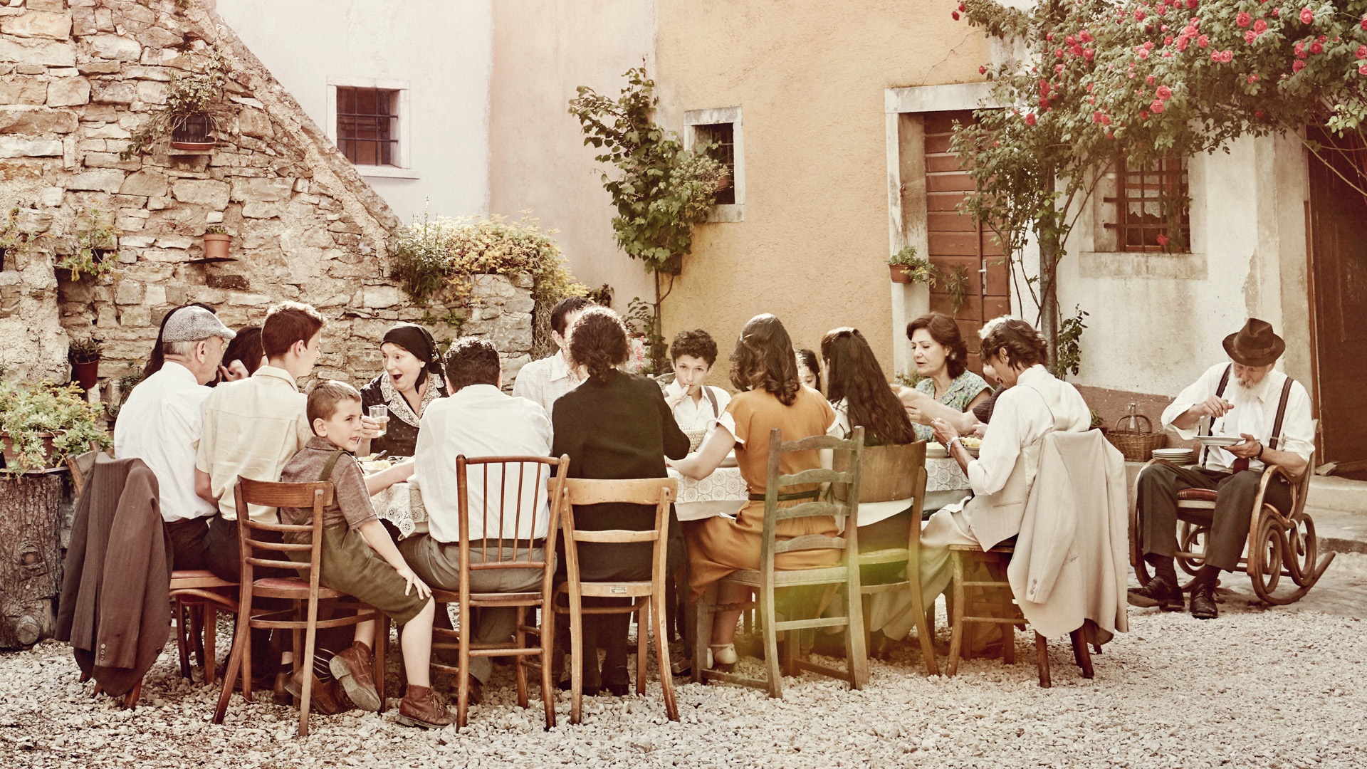
We helped Zeta increase awareness, sales and the bond between Sweden and Italy. By telling their story, Zeta went from being 400 products to one unified brand with heart.
Twice
We helped TWICE define their strategic position and establish themselves as a no-nonsense partner globally.

Situation Sthlm
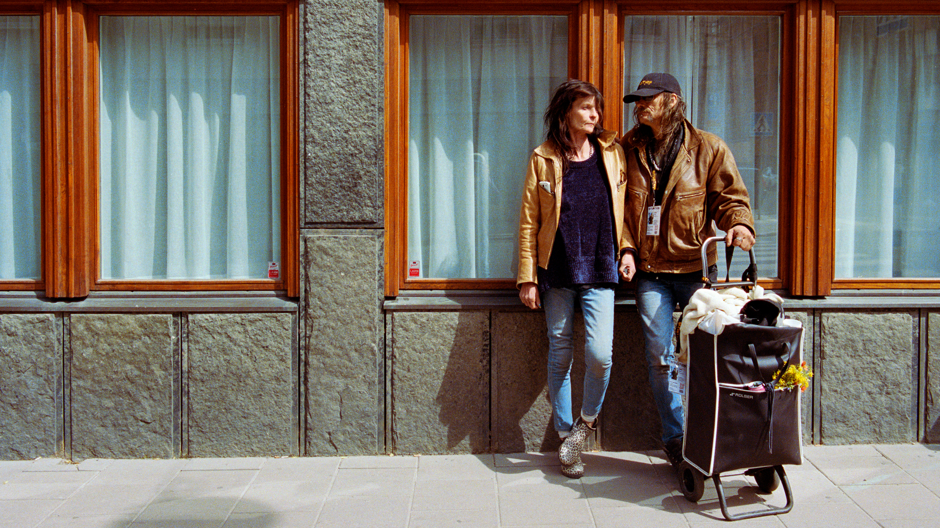
We helped Situation Sthlm turn the tide when the magazine was on the verge of bankruptcy – by telling real stories about real people.
ICA Medis
We helped ICA Supermarket Medborgarplatsen stand out in a fierce market – turning a gray space to a social hub on Södermalm.
Revelop
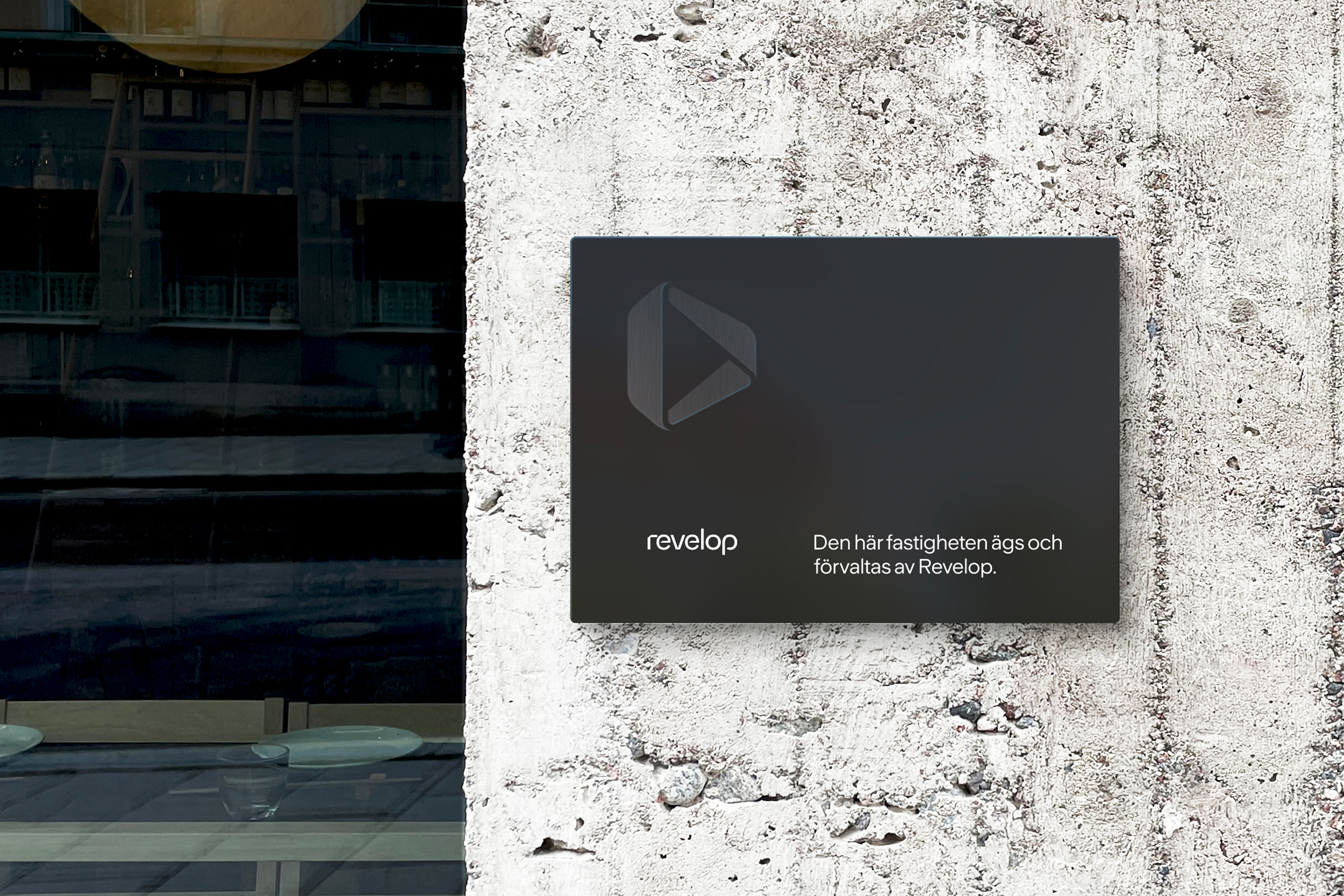
We helped Revelop transition to a green property developer by clarify their strategic position and establish a bold platform for future growth.
Cederquist
We helped Cederquist accelerate their brand to reflect their expertise, quality, and forward-thinking approach.