Overview
We helped TWICE define their strategic position and establish themselves as a no-nonsense partner globally.
About TWICE Commerce is a global beacon of sustainable shopping with over 20,000 active users – helping people globally to create small businesses – in a sustainable way. We’re chowing down on Earth’s resources like there’s no tomorrow, and that’s bad news. Both for the climate and for our collective well-being. That’s why TWICE is taking a giant leap towards a more circular world. Challenge TWICE needed to define what they strategically stood for – and establish a clear position for future growth.
Approach – Finding TWICE’s core to strengthen their position Through extensive research and strategic analysis, we identified authenticity as TWICE’s core competitive strength. Their no-nonsense approach, rooted in honesty, transparency, and clarity, became the foundation for their strategic position. Based on these insights, we developed their global brand identity and strategic platform, from naming to a comprehensive framework designed to support long-term growth. To ensure relevance with their primary growth audience, we conducted an AI-driven target audience analysis focused on Generation Z in major U.S. cities. These insights informed a scalable brand and communication strategy, enabling TWICE to connect with a new generation of users and strengthen their position in a rapidly evolving market.

WHO THE F*** ARE GEN Z? That’s the million dollar question. To find the answer, we dove deep into research, mapping their behaviors, motivations, and cultural drivers. With the help cultural insights, and audience studies, we uncovered a generation shaped by constant connectivity and rapid change. They also happen to be our primary target group. They juggle tech fluency with a passion for progress, demanding authenticity and social responsibility. Eco-conscious and culture-savvy, they’re not just the future; they’re reshaping the now.

Concept
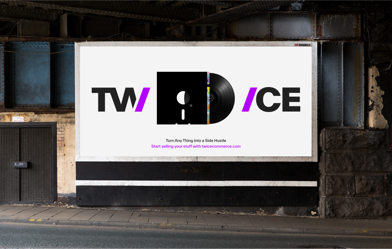
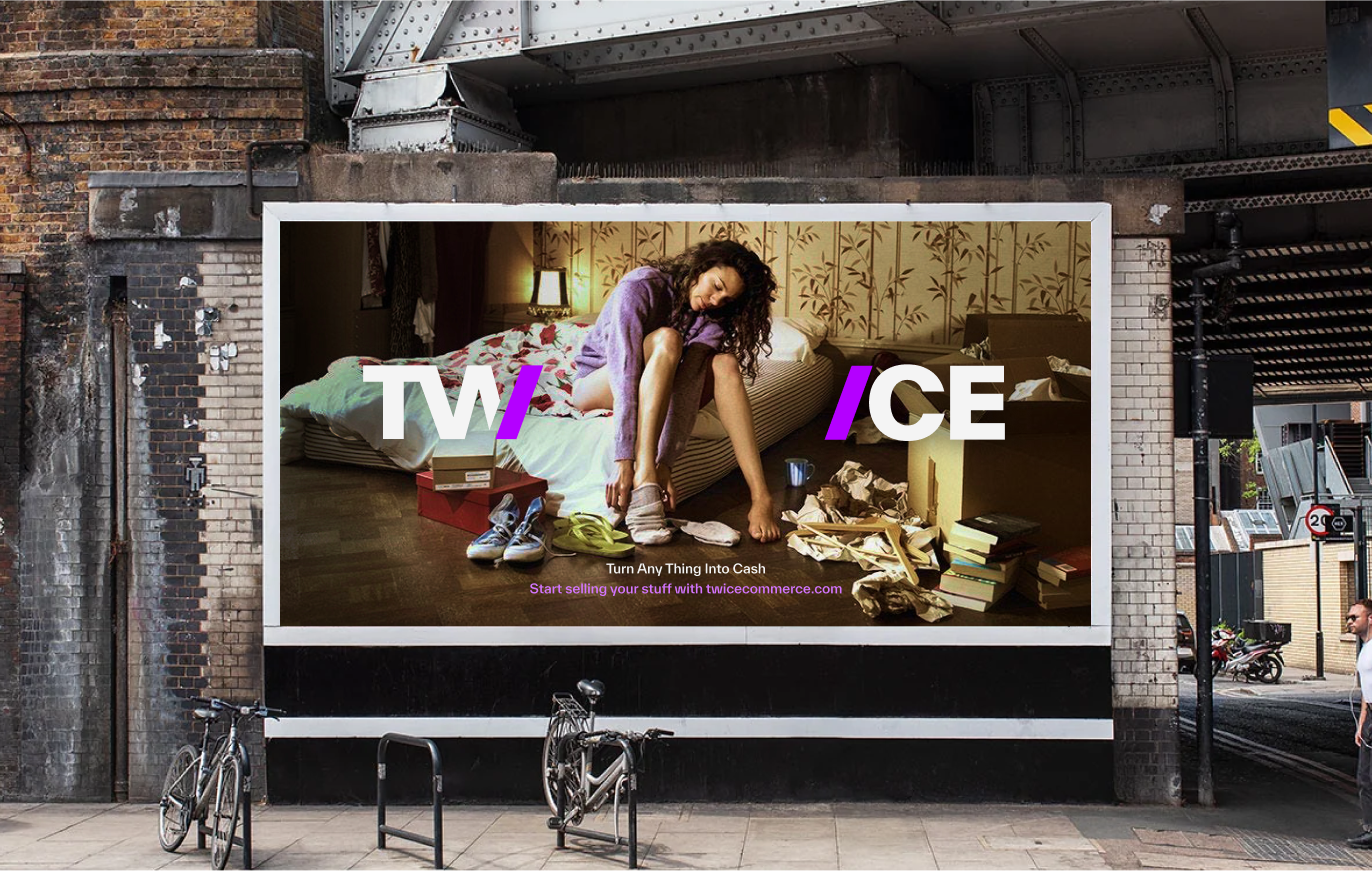
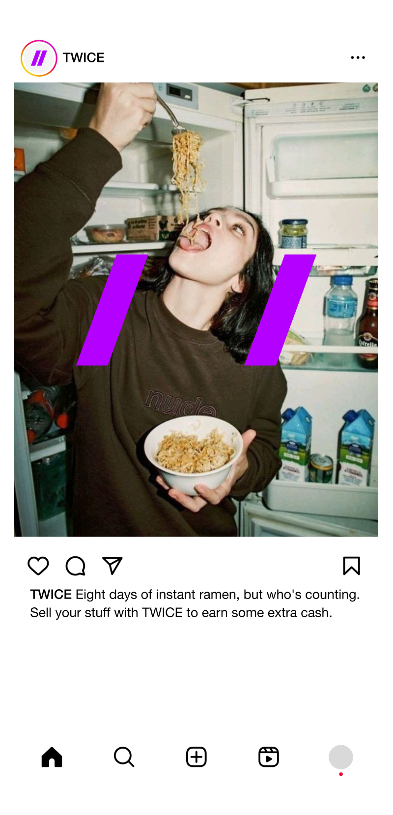
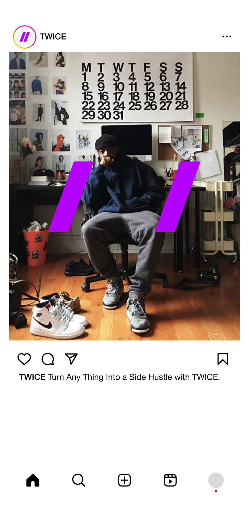
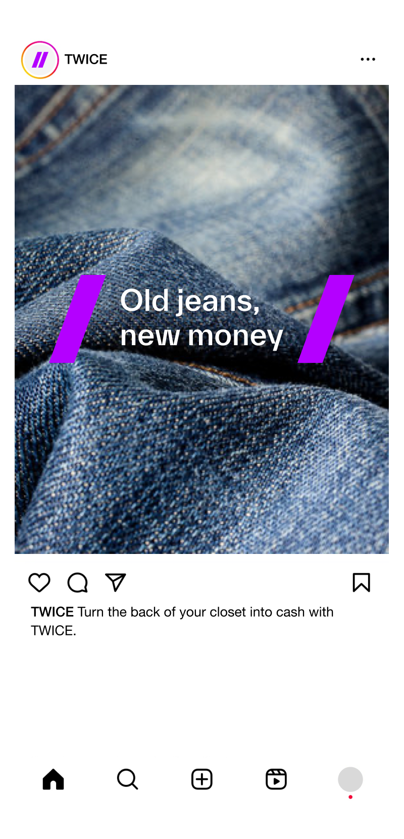
Turn any thing into…
A business, a side hustle, a new passion. The creative concept ”Turn Any Thing Into…” is the communicative soul and spirit of TWICE. It’s about the spirit of entrepreneurship, and paints a picture of a business where creativity meets opportunity. Any Thing can thrive with the right support. No matter how unconventional the product or service, TWICE provides the platform where it can find its market.
Brand identity
Our design principle
Our design philosophy is deeply rooted in our core values: ambition, progressiveness, and most critically, a no-nonsense approach. This philosophy extends beyond mere aesthetics; it is the foundation of how we communicate, operate, and engage with our community. Our design, much like our operational ethos, aim to cut through the noise, delivering a straightforward, unambiguous user experience.
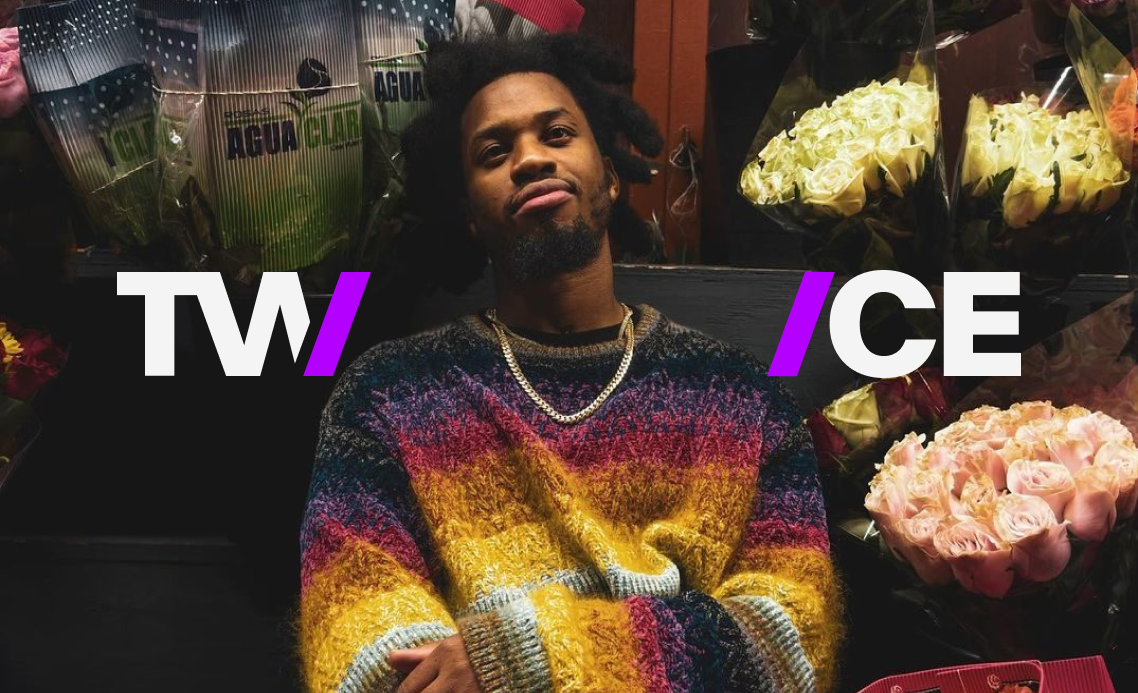
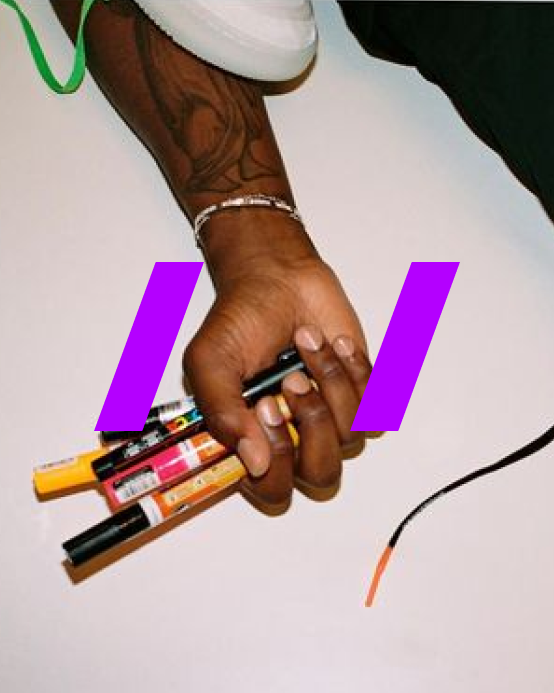
LOGOTYPE The logo represents forward thinking and constant movement. The slashes frame words and imagery, showing that anything fits within TWICE. They reference web search behavior, where anything, from sneakers to vinyl records, can be discovered.

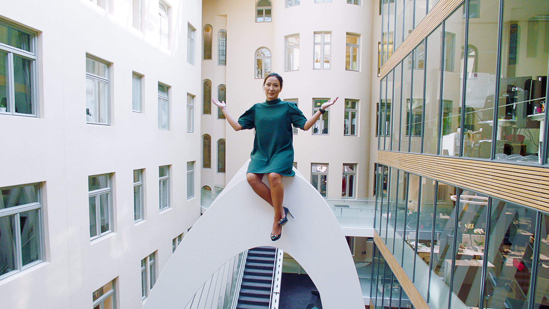
LOGO AS A VISUAL NARRATIVE The logo in the images serves as a dynamic framing device, drawing the viewer’s eye to a specific focal point within the picture. It is strategically placed to either complement the subject or to create a visual balance within the composition. We use our logo not just as a brand identifier but as a part of the bigger visual narrative.

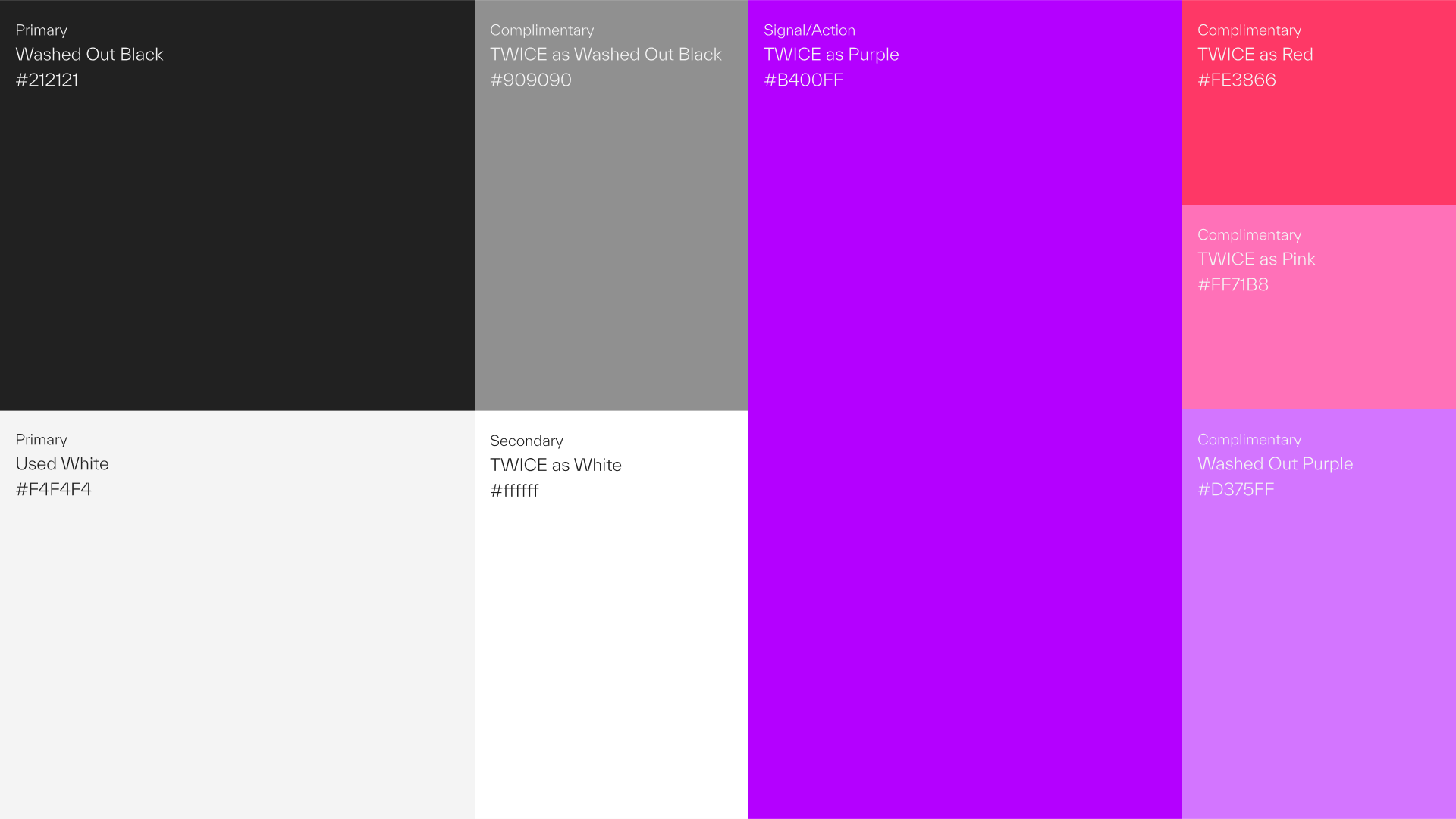
Our color palette is inspired by the concept of working with pre-used stuff. As a result, our black is not jet black but rather a washed-out tone. Similarly, our primary white is not stark white but slightly grayed.
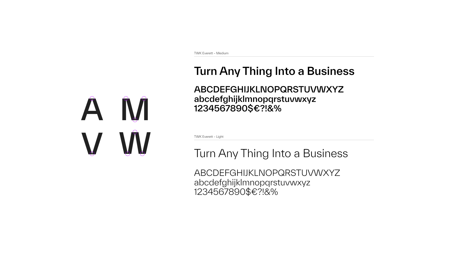
TYPOGRAPHY We use TWK Everett in two weights. Its symmetrical structure is balanced with an organic, digital character. The typography combines graphic precision with fluid readability.

Applications
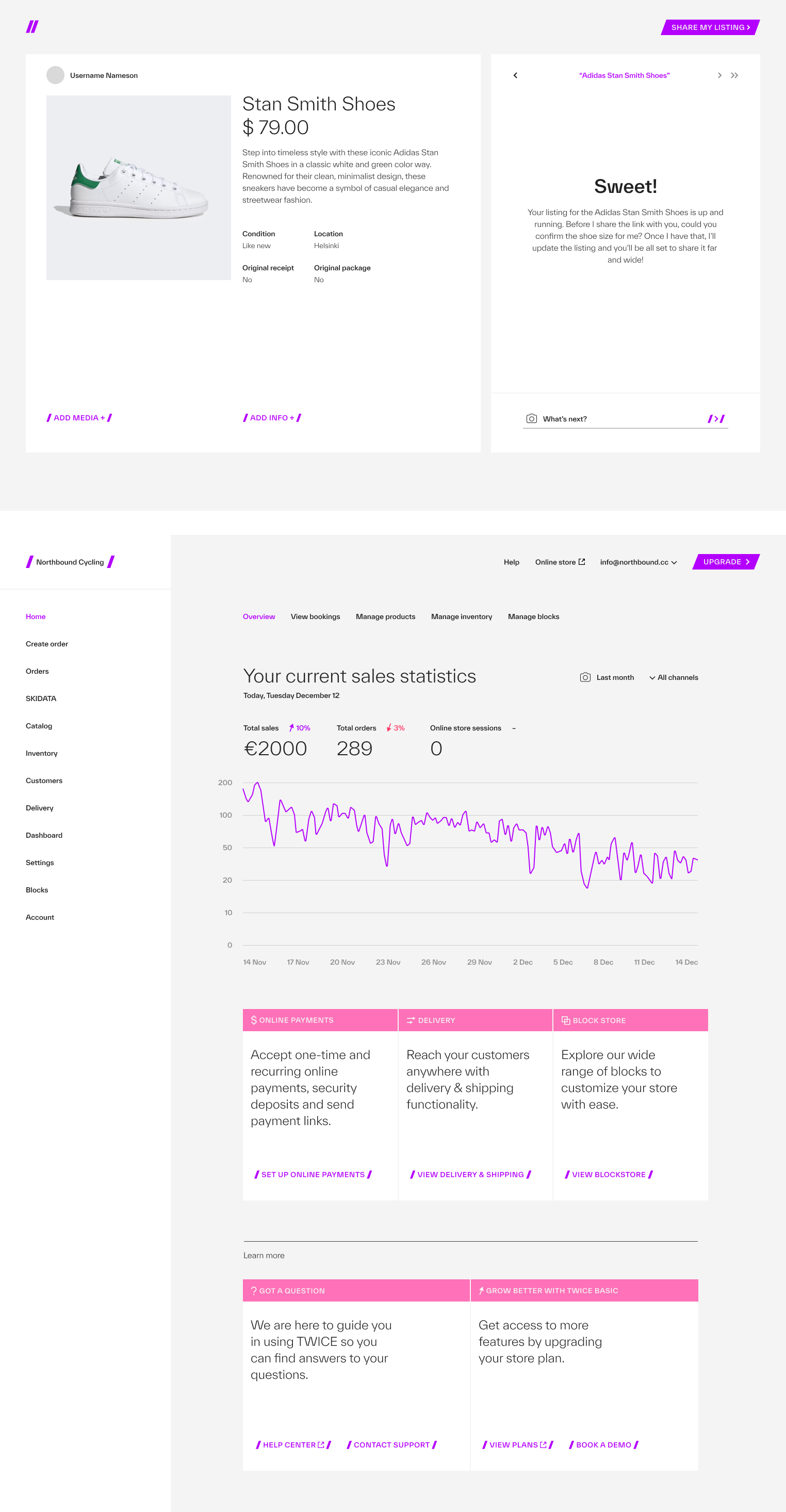
WEBSITE The website integrates the identity into every element. It serves as a clear showcase of TWICE and reinforces their role as a no-nonsense partner.
SOCIAL MEDIA We developed a social media strategy built on instant recognition and cultural relevance. Guided by Gen Z insights, every message contributes to a larger conversation around innovation, sustainability, and opportunity.
The slashes remain a core brand asset, ensuring a consistent presence. Together, they communicate TWICE as a platform where creativity, commerce, and sustainability intersect.


Cases
Musti Group
We future-proofed and accelerated Musti’s Nordic market leadership by uniting multiple brands under one promise: Pets’ Best Friend.

Wise
We helped Wise transform from a house of brands into one unified brand – building clarity, coherence, and confidence across markets, business areas, and touchpoints.

Zeta
We helped Zeta increase awareness, sales and the bond between Sweden and Italy. By telling their story, Zeta went from being 400 products to one unified brand with heart.
Twice
We helped TWICE define their strategic position and establish themselves as a no-nonsense partner globally.

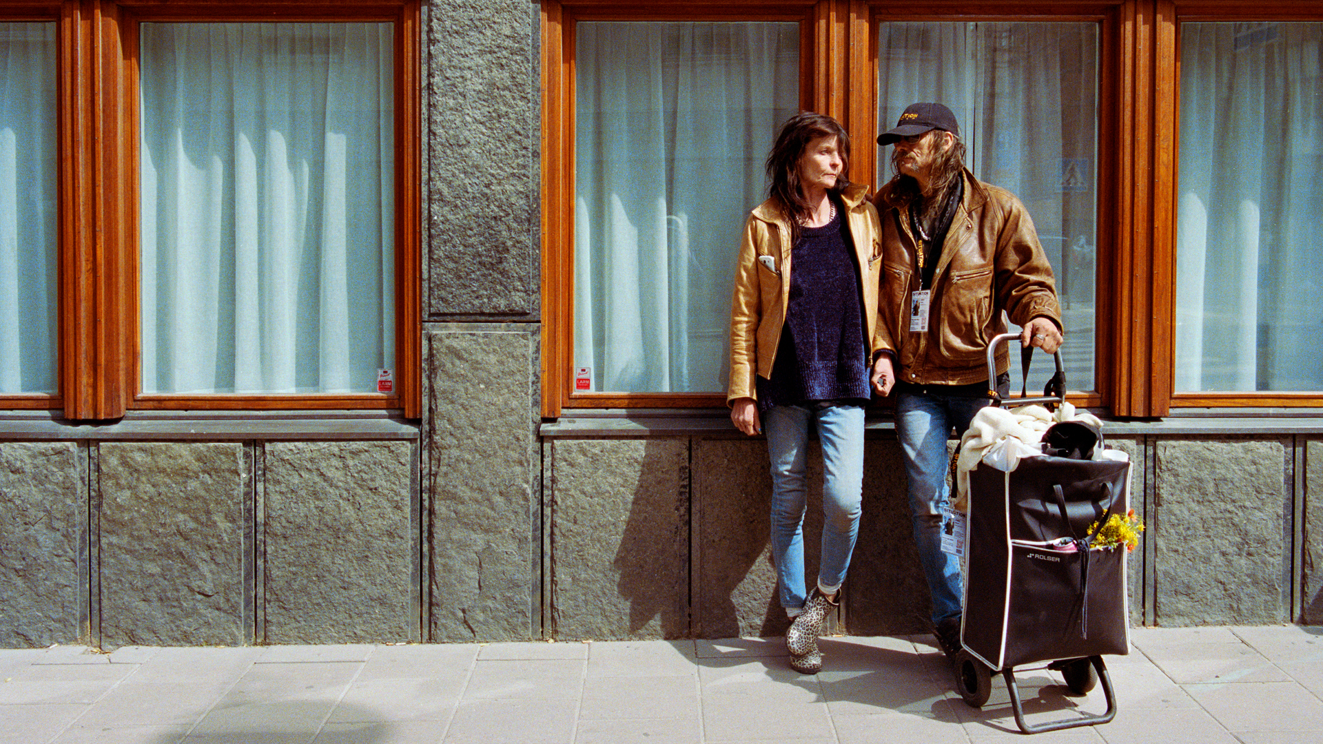
Situation Sthlm
We helped Situation Sthlm turn the tide when the magazine was on the verge of bankruptcy – by telling real stories about real people.
ICA Medis
We helped ICA Supermarket Medborgarplatsen stand out in a fierce market – turning a gray space to a social hub on Södermalm.
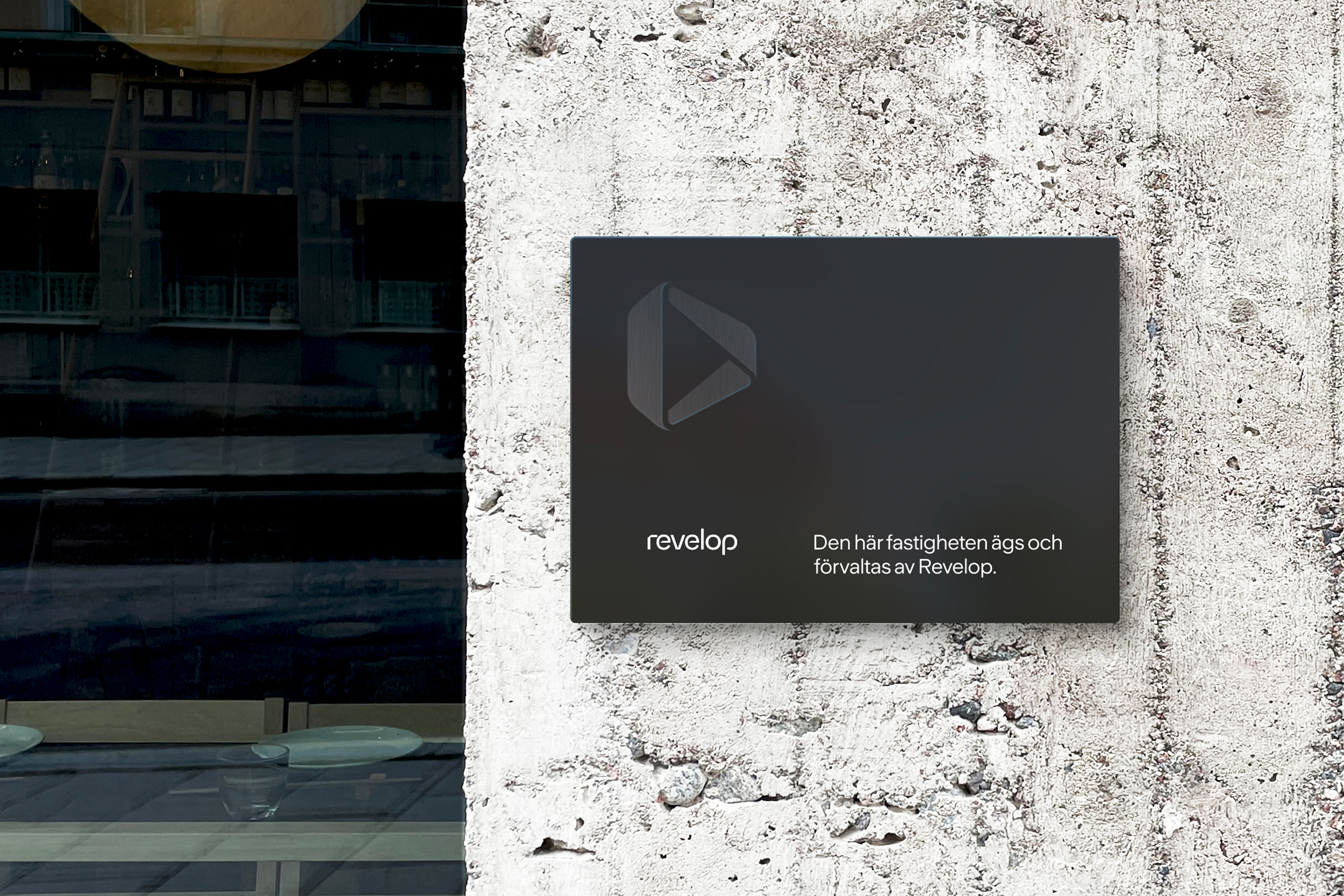
Revelop
We helped Revelop transition to a green property developer by clarify their strategic position and establish a bold platform for future growth.
Cederquist
We helped Cederquist accelerate their brand to reflect their expertise, quality, and forward-thinking approach.