Overview
We helped Cederquist accelerate their brand to reflect their expertise, quality, and forward-thinking approach.
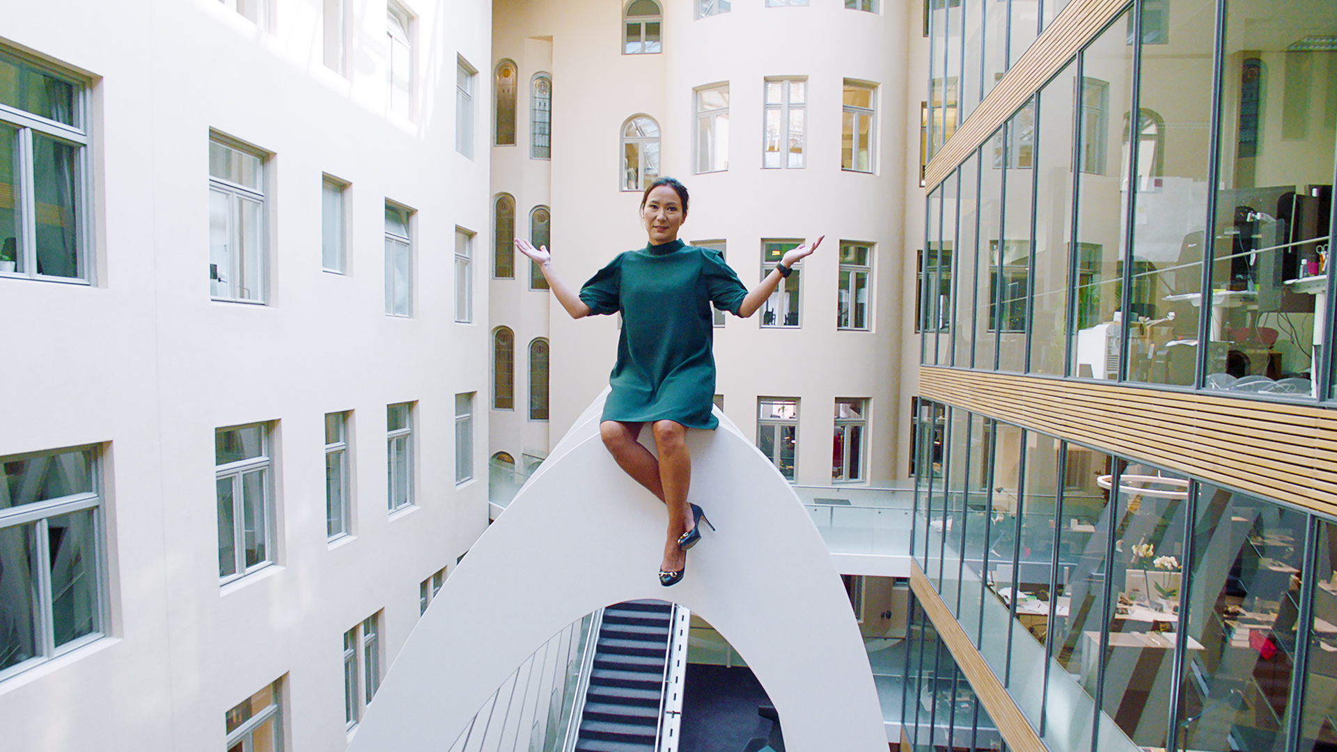
about Cederquist is one of Sweden’s leading business law firms, with over 120 lawyers advising clients across most areas of business law. While the firm had an established reputation and strong internal culture, the challenge was to elevate the brand to reflect their expertise, quality, and forward-thinking approach, ensuring they stayed ahead of competitors.
CHALLENGE The challenge was to define Cederquist’s unique position through a clear strategy, concept, and design language that would differentiate the firm while reinforcing its relevance.
Approach – BUILDING A STRONG FOUNDATION Through workshops with Cederquist’s management, we defined a new strategic foundation and overhauled the brand. By examining what truly sets Cederquist apart, as both a law firm and a workplace, we identified balance as their core differentiator. Balance between professionalism and personality. Between clarity and depth. This insight became the guiding principle for the brand, ensuring consistency, precision, and strength across all communication from the very beginning.
The pursuit of balance in this line of work can not be reactive, and can not be achieved by adjusting or compensating. Balance must exist from the very beginning.
Concept
Equilibrium
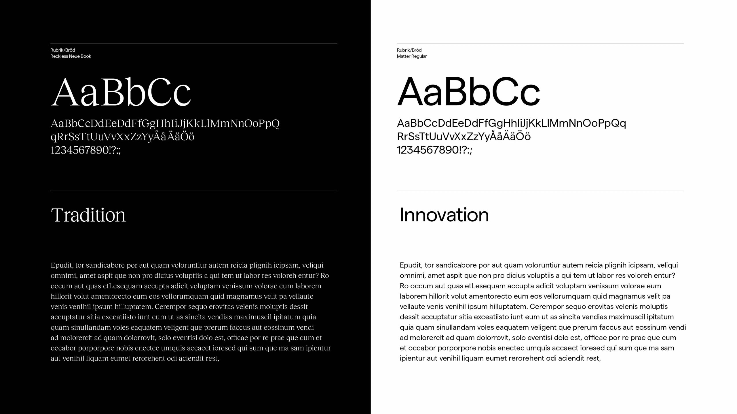
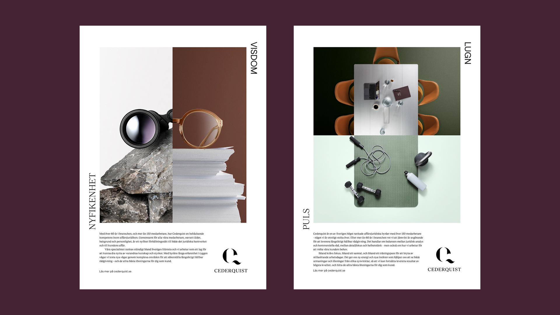
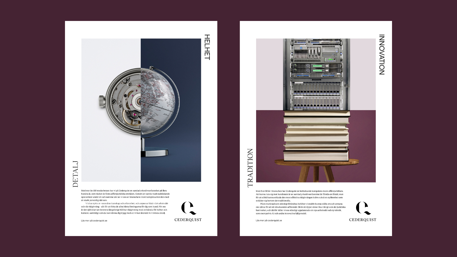
The concept of equilibrium became the foundation of the identity, expressing balance through the meeting of opposites. A classic serif paired with a modern sans serif. Color alongside black and white in photos. Professionalism balanced with personality. This principle created a distinctive and cohesive design system that elevated the brand while preserving its clarity and warmth. It also provided a powerful framework to communicate Cederquist’s core values – quality, passion, and responsiveness – in a clear and differentiated way.

Brand Identity
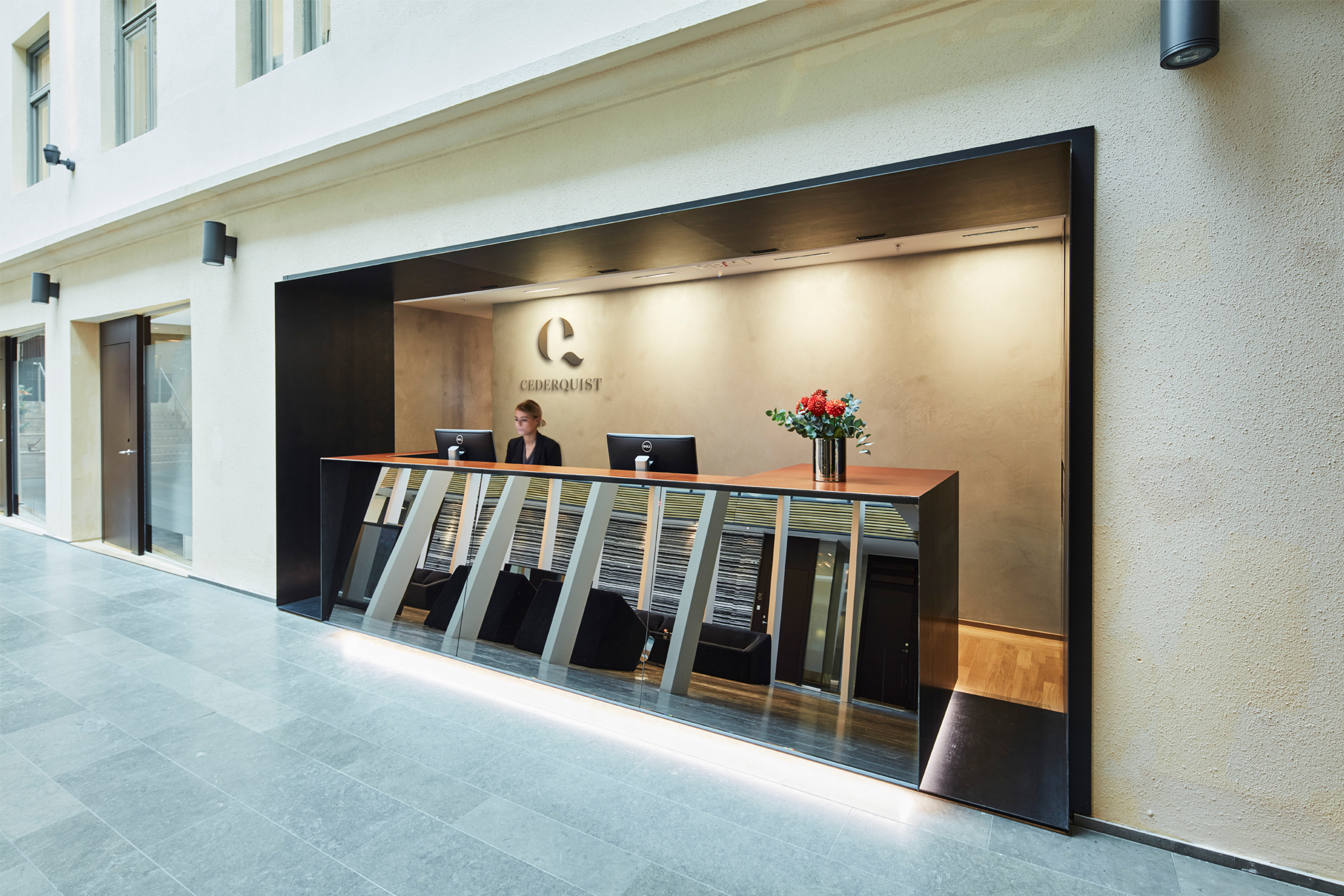
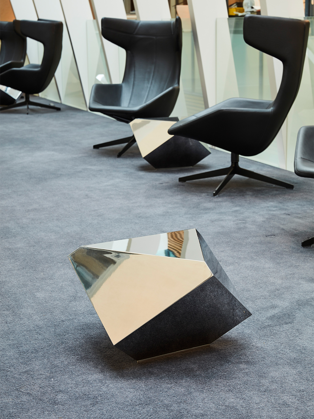
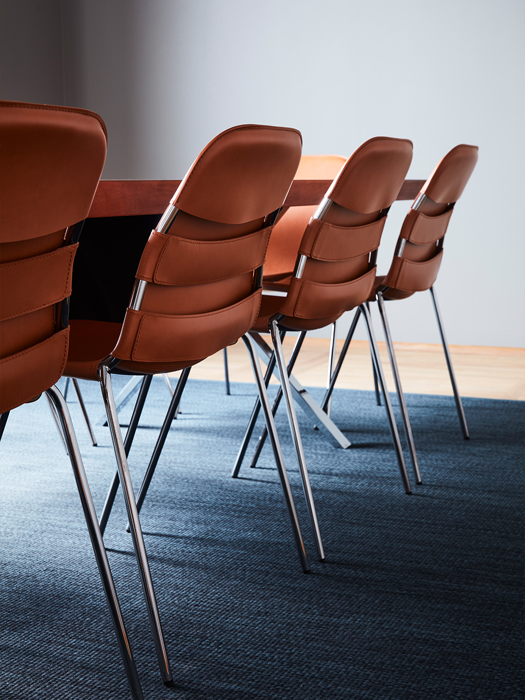
ESTABLISHING A BRAND PLATFORM To ensure a cohesive identity, the concept of equilibrium was applied across all touchpoints, from advertising and digital platforms to the physical office. By consistently balancing contrasting elements, such as serif and sans serif typefaces or color and monochrome imagery, we created a distinctive and unified visual system. The result is a flexible identity that strengthens recognition and performs seamlessly across print, motion, and digital environments.
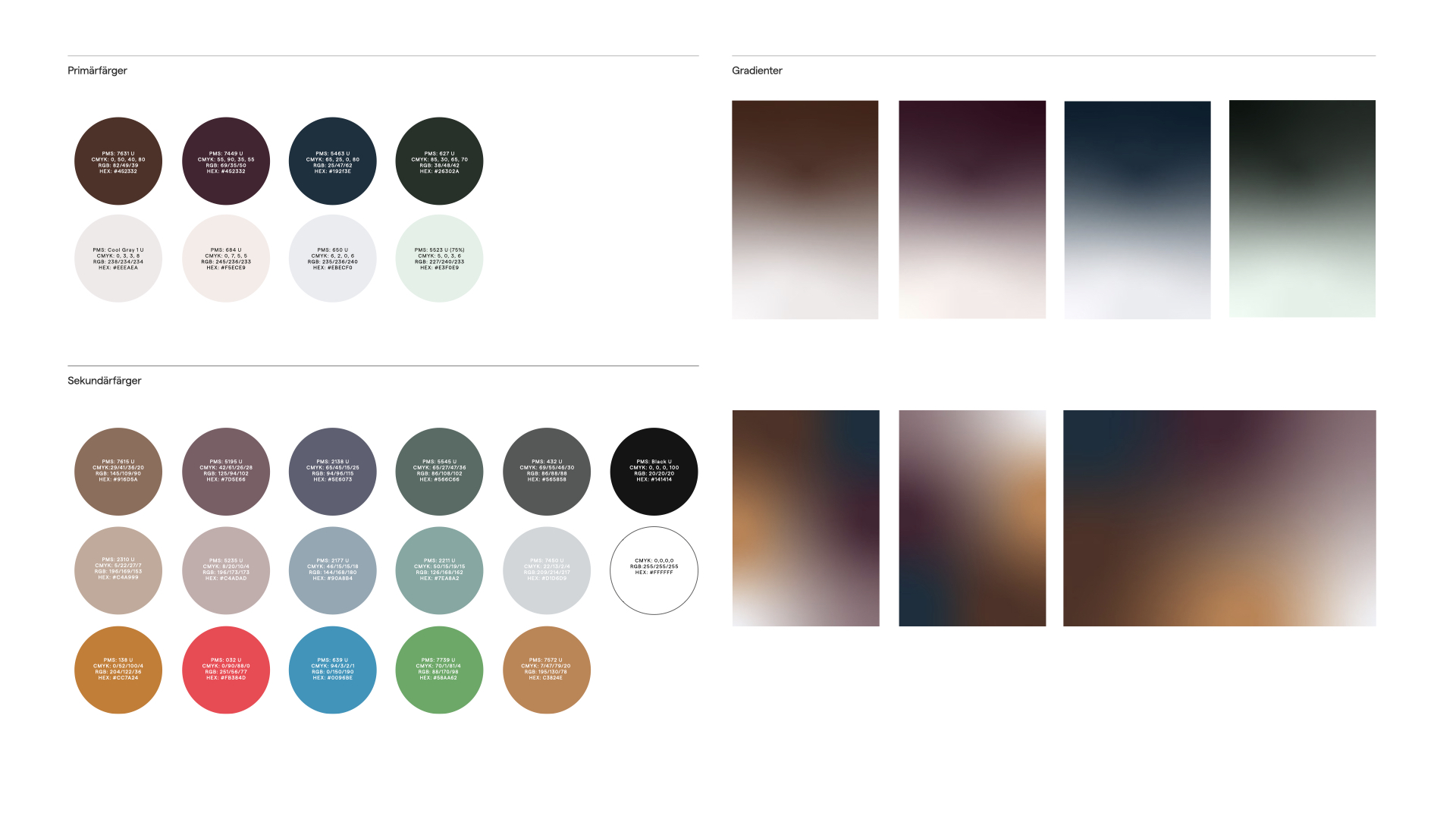


Opposites attract Our color palette consists of contrasting colors used together to visualize the concept of equilibrium. To further portray the concept, we use gradients of two different colors moving towards each other, allowing us to find the perfect balance in more ways than just black and white.


Results
Cederquist achieved their high set goal in 2019 and have since maintained their position as one of the top 3 players on the business law market in Stockholm.
They have simultaneously taken an impressive position as a value-driven law firm where the target audience choose Cederquist over it’s competitors based on profiles working methods offer and communication.
Gold Publishingpriset
Silver Svenska designpriset
Cases
Musti Group
We future-proofed and accelerated Musti’s Nordic market leadership by uniting multiple brands under one promise: Pets’ Best Friend.

Wise
We helped Wise transform from a house of brands into one unified brand – building clarity, coherence, and confidence across markets, business areas, and touchpoints.

Zeta
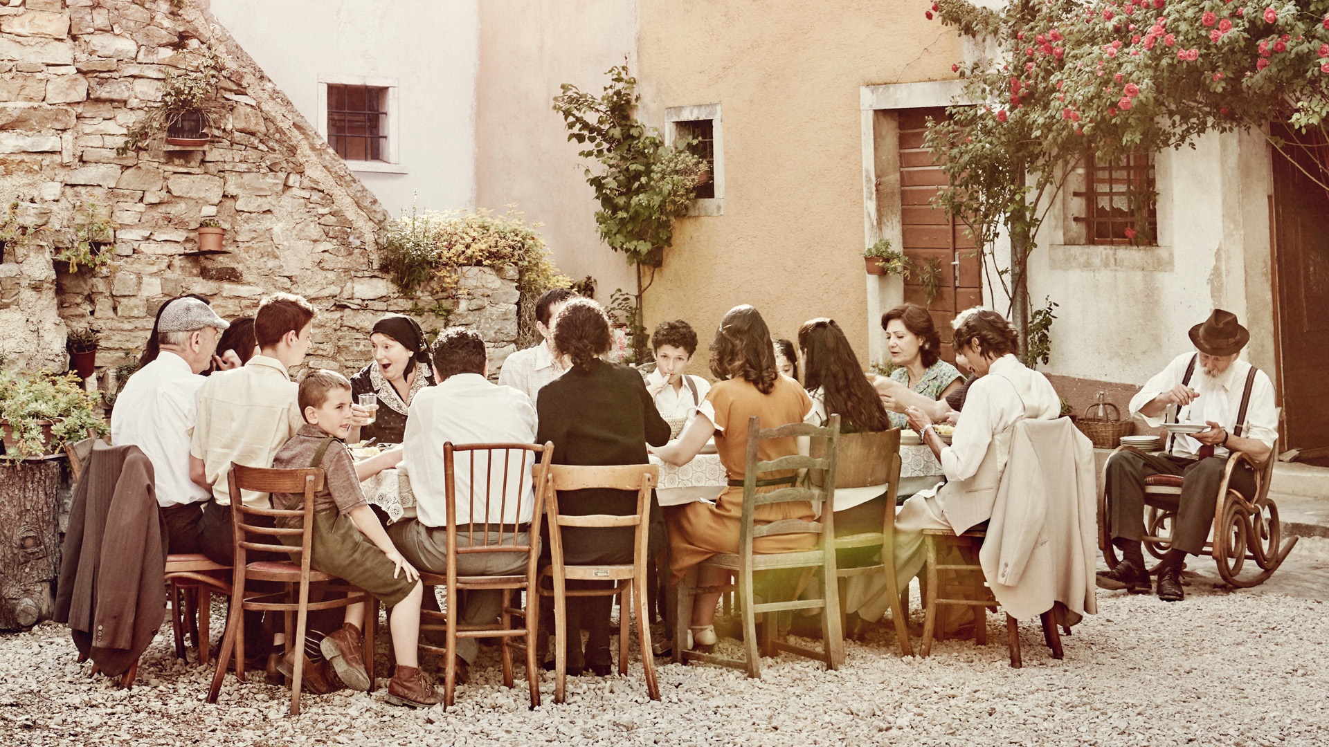
We helped Zeta increase awareness, sales and the bond between Sweden and Italy. By telling their story, Zeta went from being 400 products to one unified brand with heart.
Twice
We helped TWICE define their strategic position and establish themselves as a no-nonsense partner globally.

Situation Sthlm
We helped Situation Sthlm turn the tide when the magazine was on the verge of bankruptcy – by telling real stories about real people.

ICA Medis
We helped ICA Supermarket Medborgarplatsen stand out in a fierce market – turning a gray space to a social hub on Södermalm.
Revelop
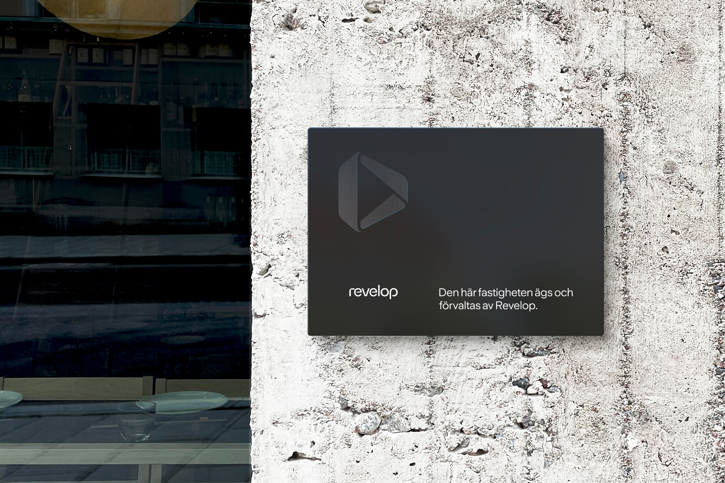
We helped Revelop transition to a green property developer by clarify their strategic position and establish a bold platform for future growth.
Cederquist
We helped Cederquist accelerate their brand to reflect their expertise, quality, and forward-thinking approach.