Overview
We helped Revelop transition to a green property developer by clarify their strategic position and establish a bold platform for future growth.
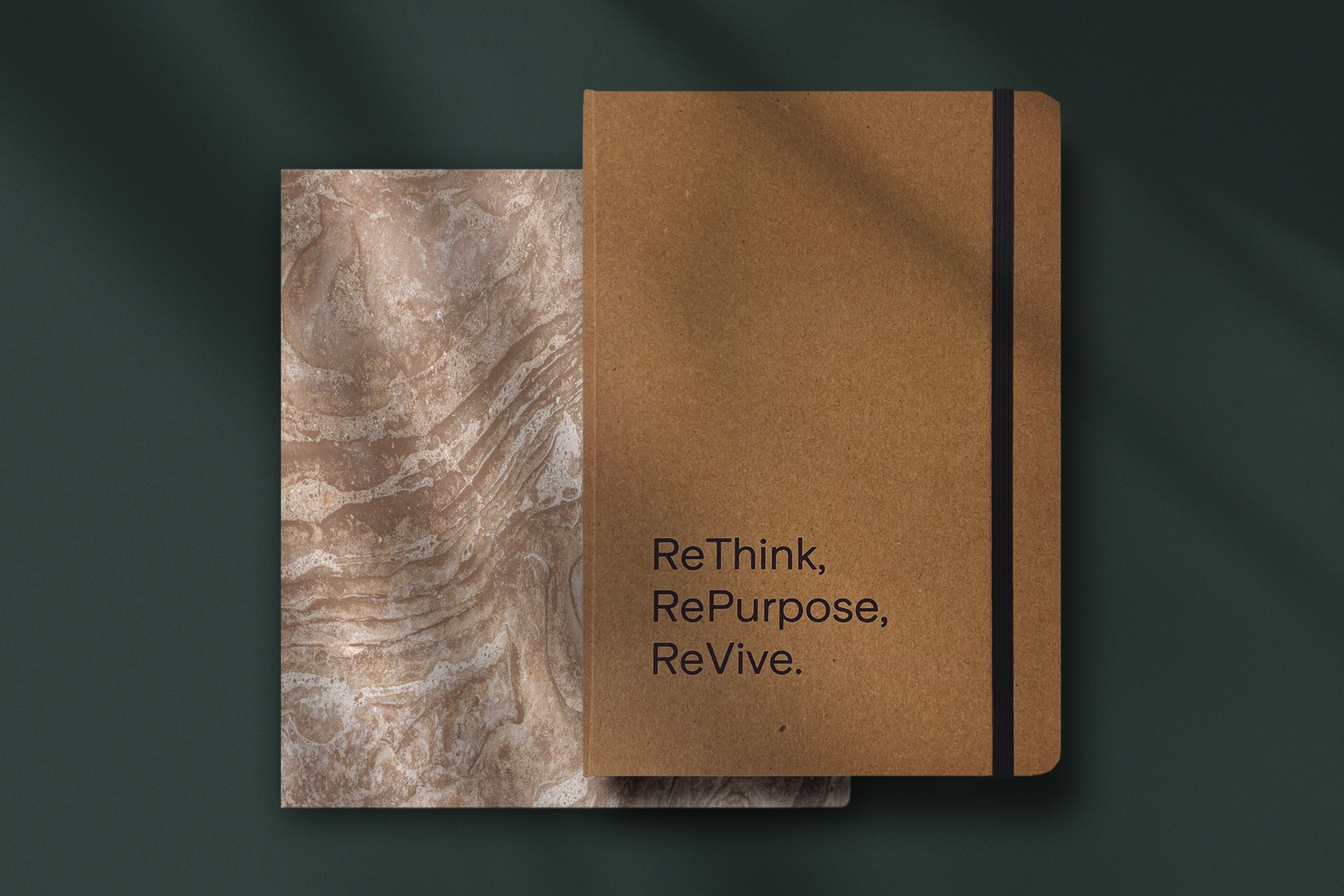
Changing the name and the game Formerly known as Profi Fastigheter, the company had a long and successful track record. With new management in place, they saw the need to strengthen their market position and align the brand with their evolving business strategy. It was time to rethink, repurpose, and revive. Revelop sees opportunities where other property developers see challenges. They invest where they can create long-term value by repositioning and developing properties with a strong focus on sustainability.
Challenge The real estate industry has long been traditional and financially rewarding, with limited pressure to change. The challenge was to create a brand that could engage a diverse audience, from institutional investors and municipalities to commercial and residential tenants.
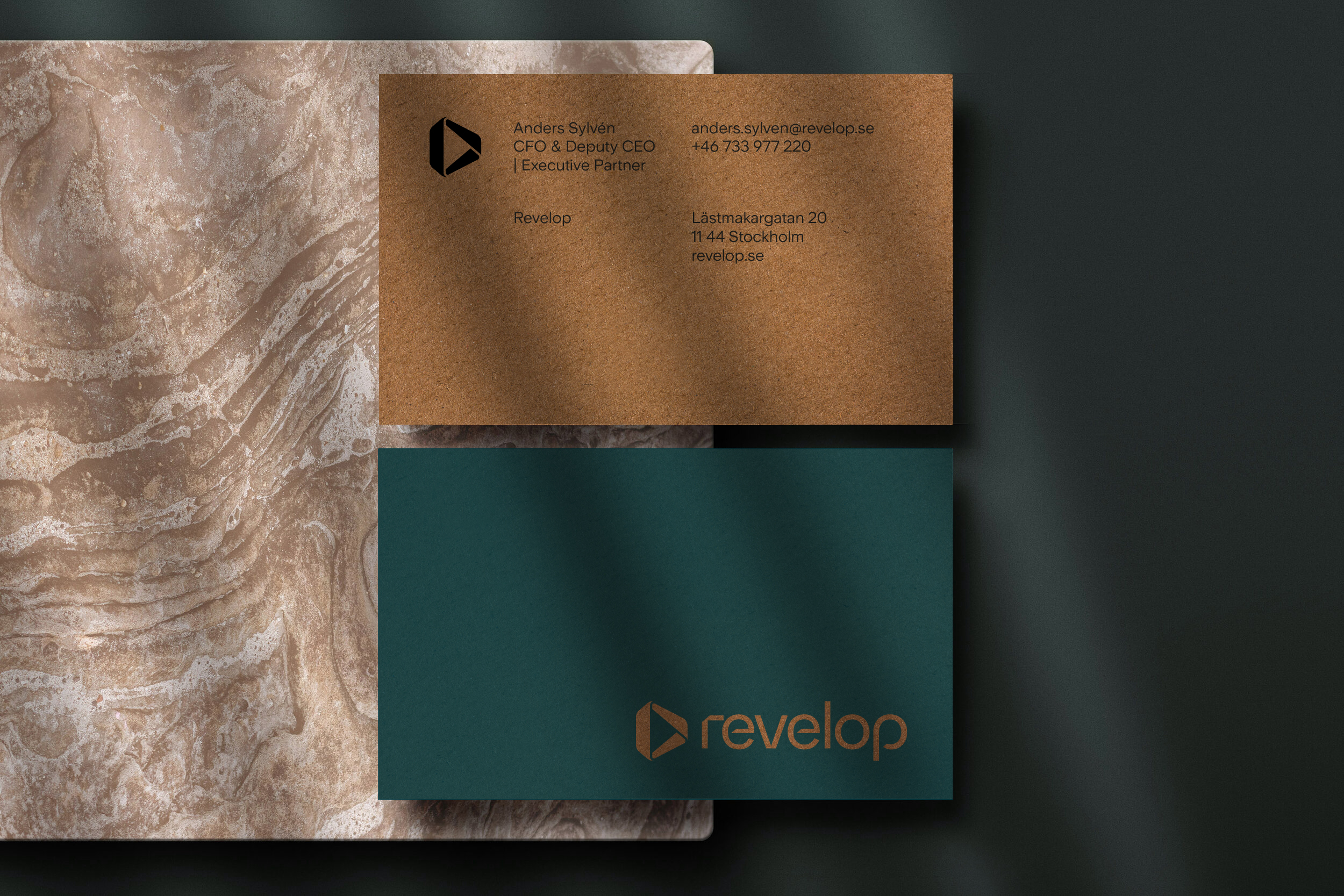
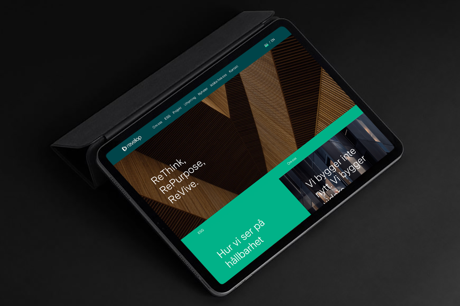
Approach We defined a clear strategic direction, vision, mission, and brand values, establishing a clear route forward. We conducted workshops, stakeholder interviews, and global trend analysis to define a direction that was both emotionally relevant and commercially viable. We developed clear target group personas, spanning institutional investors, municipalities, and tenants. Based on these insights, we defined the positioning and brand values, exploring strategic routes together with the client before committing fully to sustainability and CSR as the core business platform. With the strategy in place, we led the naming process which resulted in Revelop, a distinctive name reflecting the company’s vision and ambition. Building on this foundation, we developed a concept that unified brand, design, and communication.
Concept
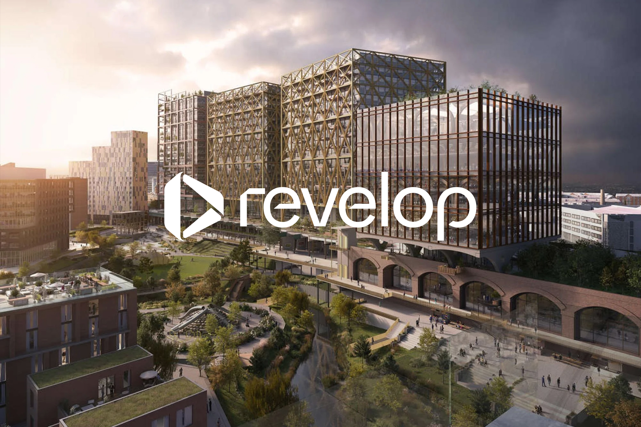
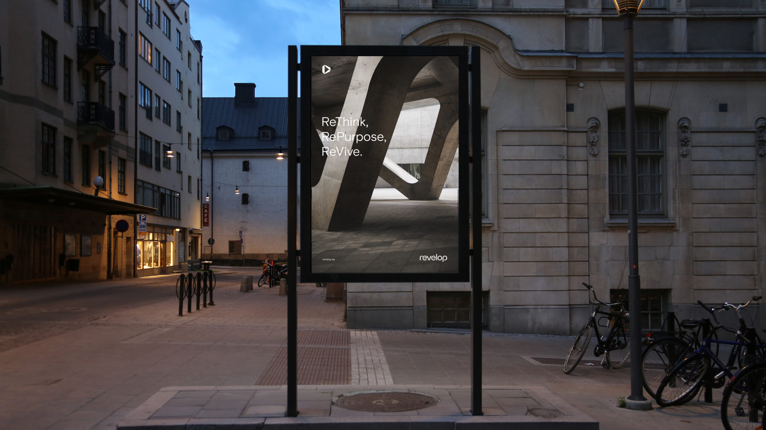
Reinventing places that work.
Revelop distinguishes itself through a smarter, courageous, and more responsible approach to real estate. By identifying untapped opportunities and redefining what sustainable workplaces can be, they stay ahead of the market. Their courage enables them to challenge industry norms, while their responsibility drives meaningful, long-term change. This foundation shaped a communication concept built on thinking new, thinking differently, and thinking sustainably. In short: reinventing places that work.

Brand identity
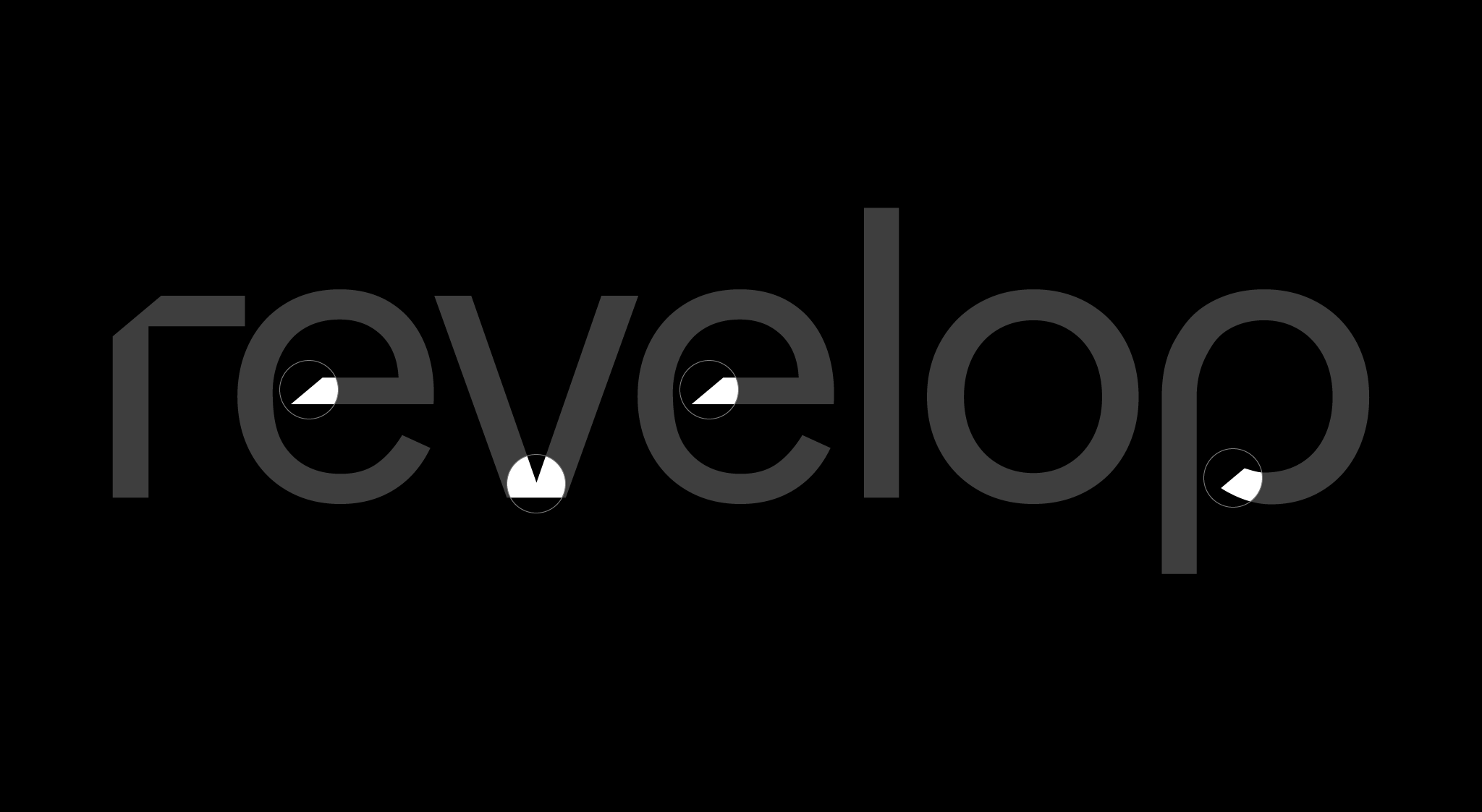
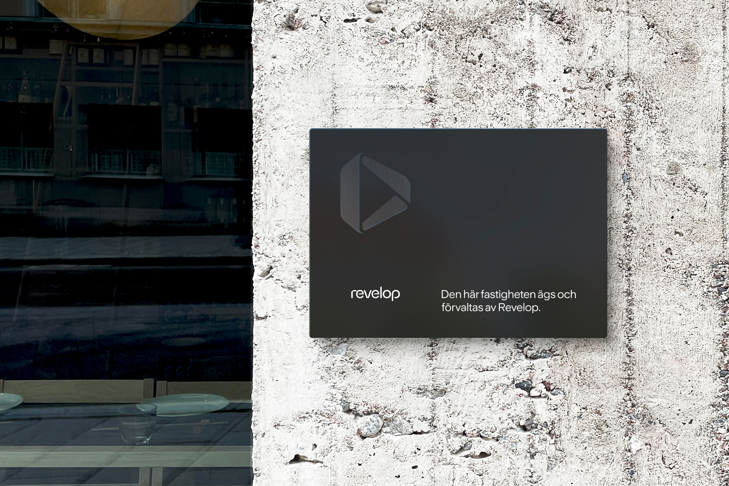
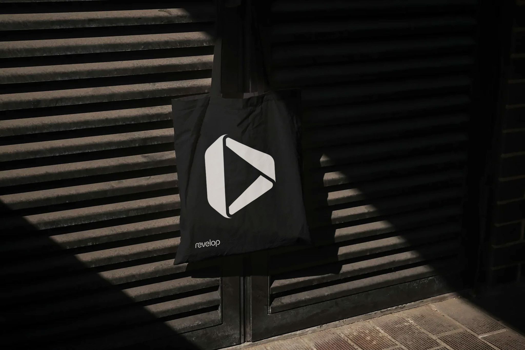
REINVENTING The symbol was inspired by the Möbius strip, a form representing continuous transformation and reinvention. It reflects Revelop’s mission to reposition and develop properties to create sustainable environments. By referencing a universally recognized symbol of circularity, the mark reinforces Revelop’s commitment to long-term value and sustainability.
PROPORTIES The symbol’s outline forms a three-dimensional block, referencing an architectural structure. This reflects Revelop’s core business, property development, and reinforces the brand’s connection to the built environment.
OF TOMORROW The inner shape forms a forward-pointing arrow, symbolizing progress and long-term value creation. It reflects Revelop’s strategy to develop sustainable, cost-efficient properties designed to stand the test of time, for present and future generations.
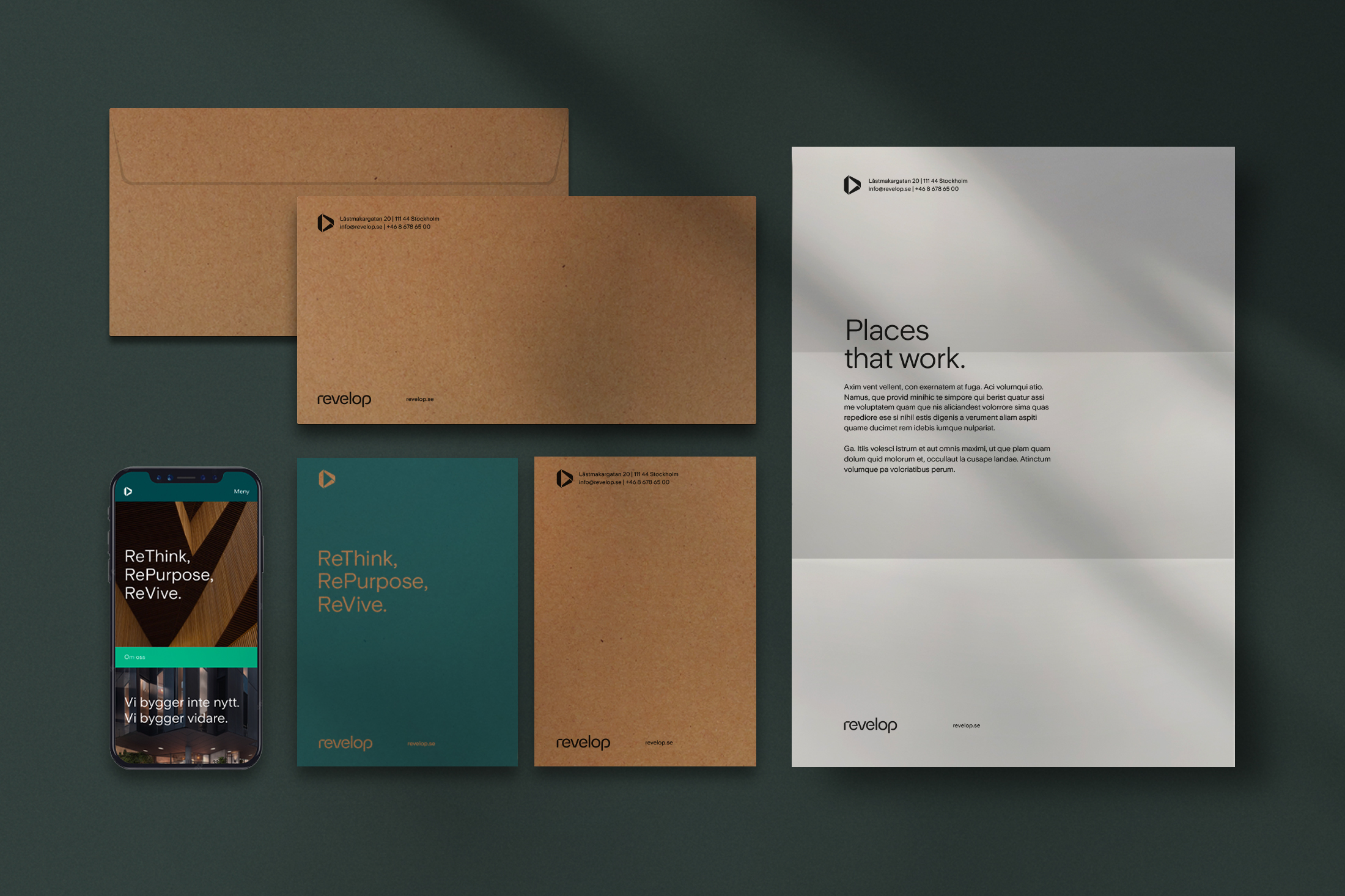
Applications

Results
Although still early in its transformation, Revelop has already raised the largest real estate fund in seven years.
The clear strategic position and distinctive brand have strengthened investor confidence and helped accelerate the company’s growth.
Case studies
Musti Group
We future-proofed and accelerated Musti’s Nordic market leadership by uniting multiple brands under one promise: Pets’ Best Friend.

Wise
We helped Wise transform from a house of brands into one unified brand – building clarity, coherence, and confidence across markets, business areas, and touchpoints.

Zeta
We helped Zeta increase awareness, sales and the bond between Sweden and Italy. By telling their story, Zeta went from being 400 products to one unified brand with heart.
Twice
We helped TWICE define their strategic position and establish themselves as a no-nonsense partner globally.

Situation Sthlm
We helped Situation Sthlm turn the tide when the magazine was on the verge of bankruptcy – by telling real stories about real people.

ICA Medis
We helped ICA Supermarket Medborgarplatsen stand out in a fierce market – turning a gray space to a social hub on Södermalm.
Revelop
We helped Revelop transition to a green property developer by clarify their strategic position and establish a bold platform for future growth.
Cederquist
We helped Cederquist accelerate their brand to reflect their expertise, quality, and forward-thinking approach.